Type
New design
Role
UX Designer
Platform
Mobile
Design Tools
Figma
Duration
4 Months
When I began my current role in mobility support I noticed that we were getting a lot of calls for problems that the techs could solve on their own.
Technicians are trained on the software, but not troubleshooting the work phone when issues occur.
My role was to envision a design solution that addressed key pain points technicians regularly encounter in the field.
Admin support perceptions
Several administrators expressed skepticism about whether another tool would be necessary. Many believed technicians already had adequate support through phone calls, messaging platforms like Zinc, and guidance from field service managers. These conversations revealed that while support resources existed, technicians often relied on them because troubleshooting documentation were difficult to access quickly during service calls. This insight reinforced the need for a solution that could provide fast, clear troubleshooting guidance directly on the technician’s phone, reducing reliance on real-time support.
Problem Statement
-
Field technicians are not trained to check company troubleshooting website for help
-
Troubleshooting documentation is is lengthy and requires internet connection
-
Searching while on-site with a customer increases repair time and stress.
The goal of the MSD Troubleshooter is to create a fast, mobile-friendly way for technicians to locate the correct troubleshooting path within seconds.
Constraints
Designing for field technicians required a mobile-first experience that could be used quickly and easily while working on-site with customers. Because technicians frequently operate in areas with limited or unreliable internet connectivity, the app needed to function offline and present troubleshooting steps in clear, simplified instructions that could be followed under time pressure. The design also needed to include a direct connection to the support desk, allowing technicians to escalate issues when automated troubleshooting paths were not sufficient.
Benifits
Increase the number of technicians available to service customer accounts
Help technicians that cannot call or text support due to remote location and poor signal
Lower the call volume to allow support desk to focus on complex troubleshooting tickets
Design process: pre Google UX education
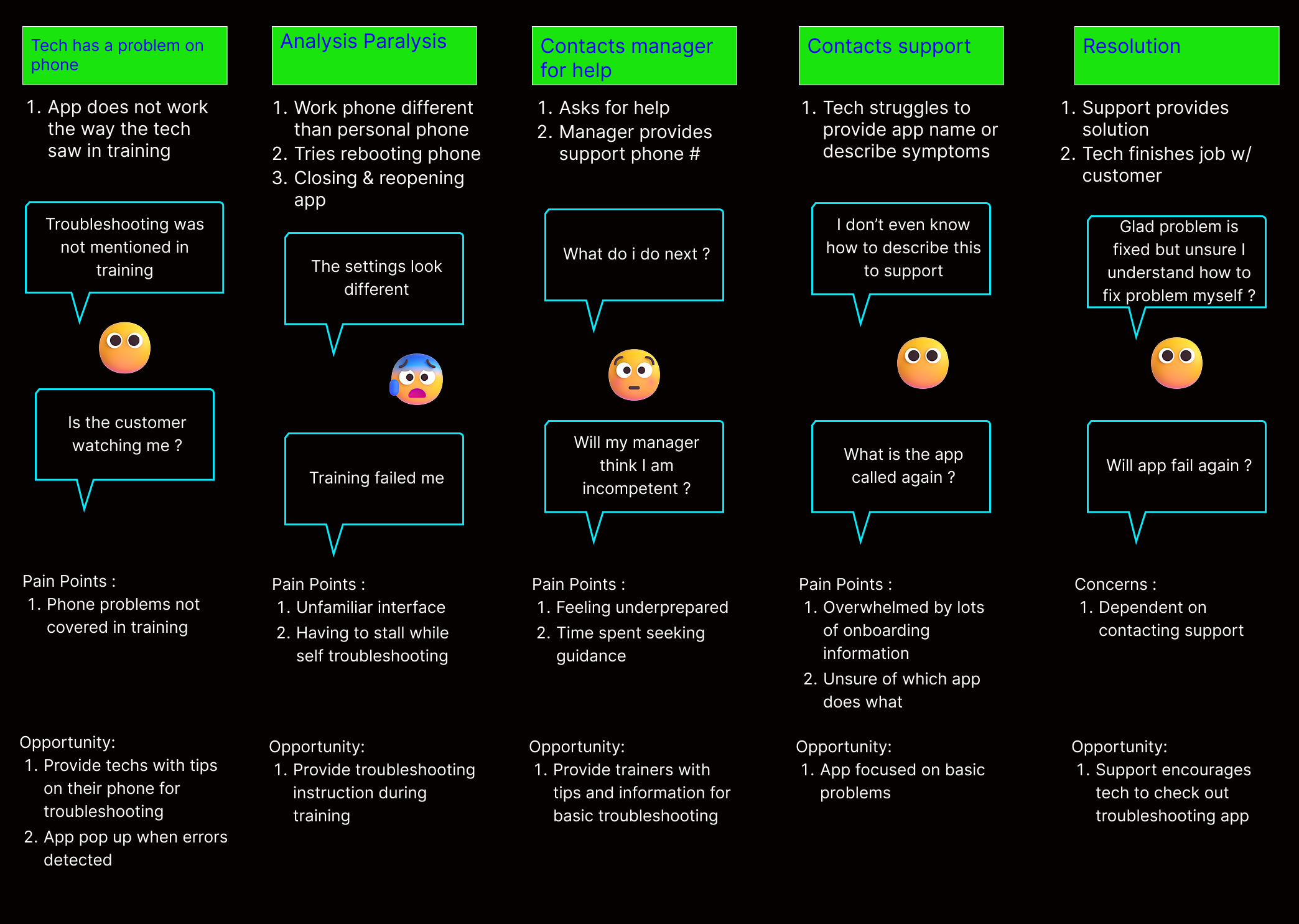
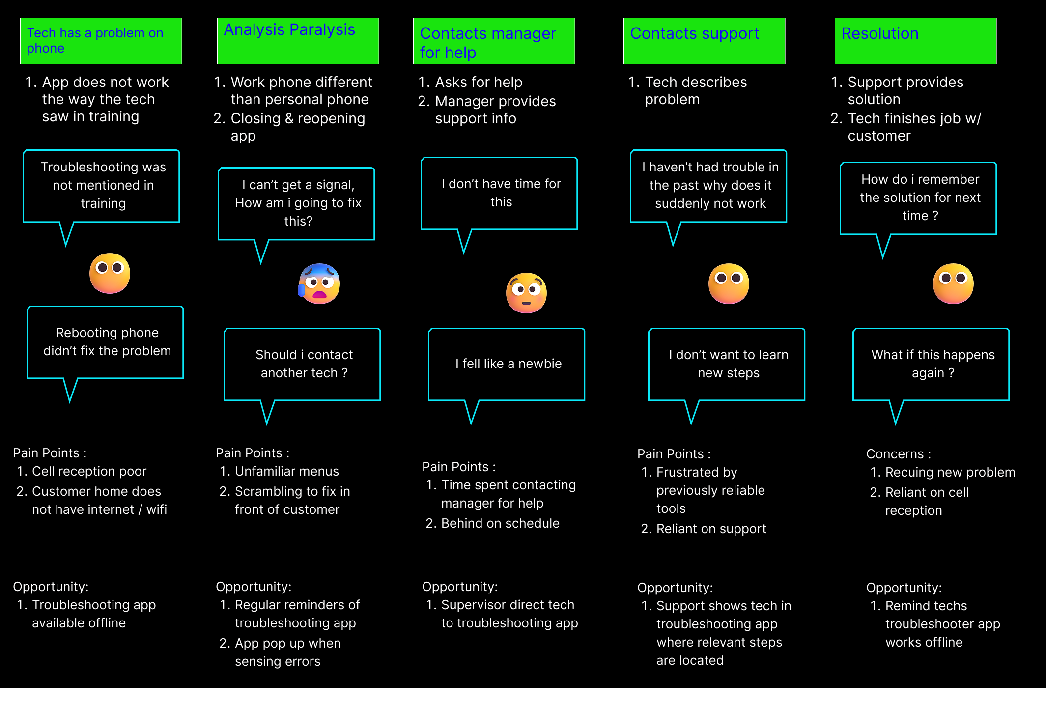
I began designing the app without knowledge of a formal design process. I started in high fidelity because I was teaching myself Figma while designing the app. Daily interactions with techs informed my design decisions
Personas
New Tech
Recently onboarded tech who are still learning the job. They benifit from clear instruction and simplified language
Goals
- Learn company workflows and tools as quickly as possible
- Navigate apps with confidence
- Solve issues independently without needing to call support
Frustrations
- Unfamilar with limitations on a company issued phone
- Gets logged out or lost in the app menus
- Long documents / explanations
Remote Tech
Techs working in low signal areas; need troubleshooting that functions reliably offline.
Goals
- Complete tasks effectively in areas with no signal
- Troubleshoot problems without having to contact support
- Arrive on time to appointments despite distance
Frustrations
- Low signal causes app features to fail or stall
- Instructions assume constant connectivity
- Sync issues lead to lost progress

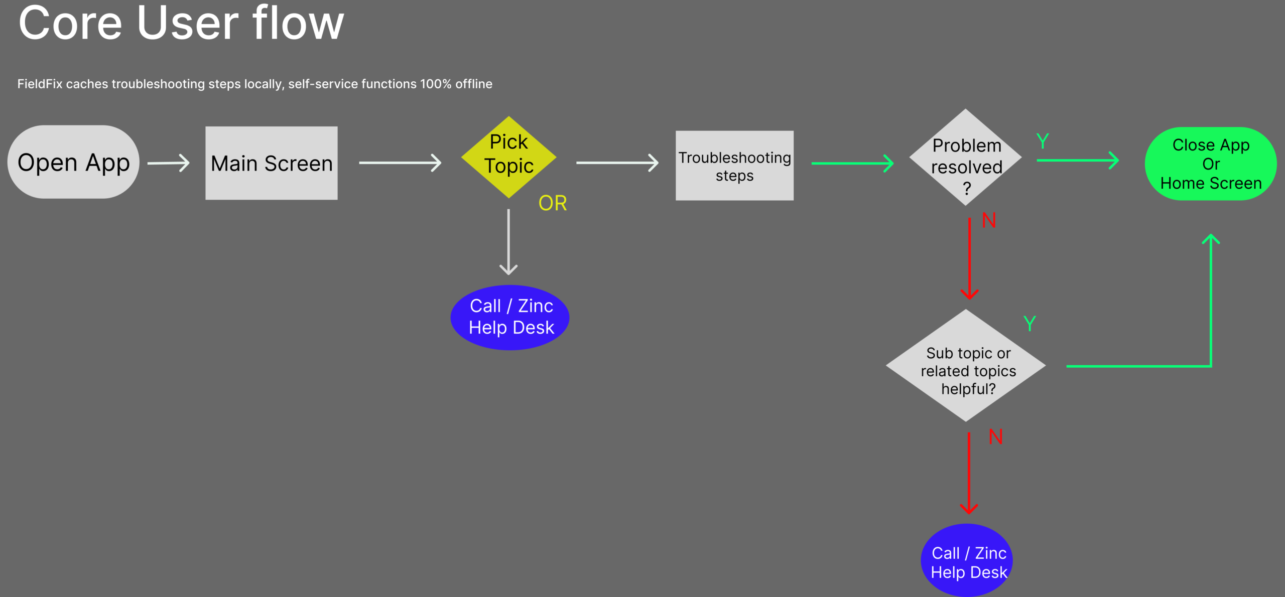
User flow
Simplicity is paramount for technicians attempting to troubleshoot without assistance. Navigation is simple and logical
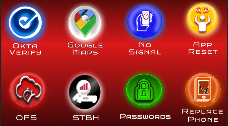
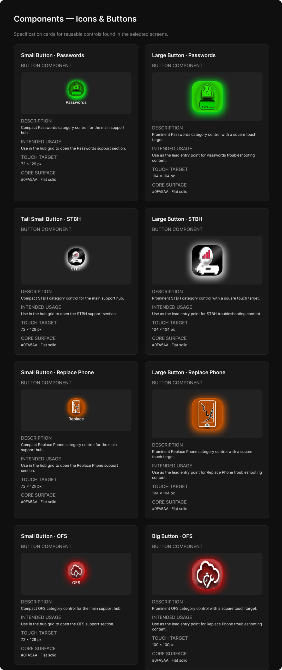
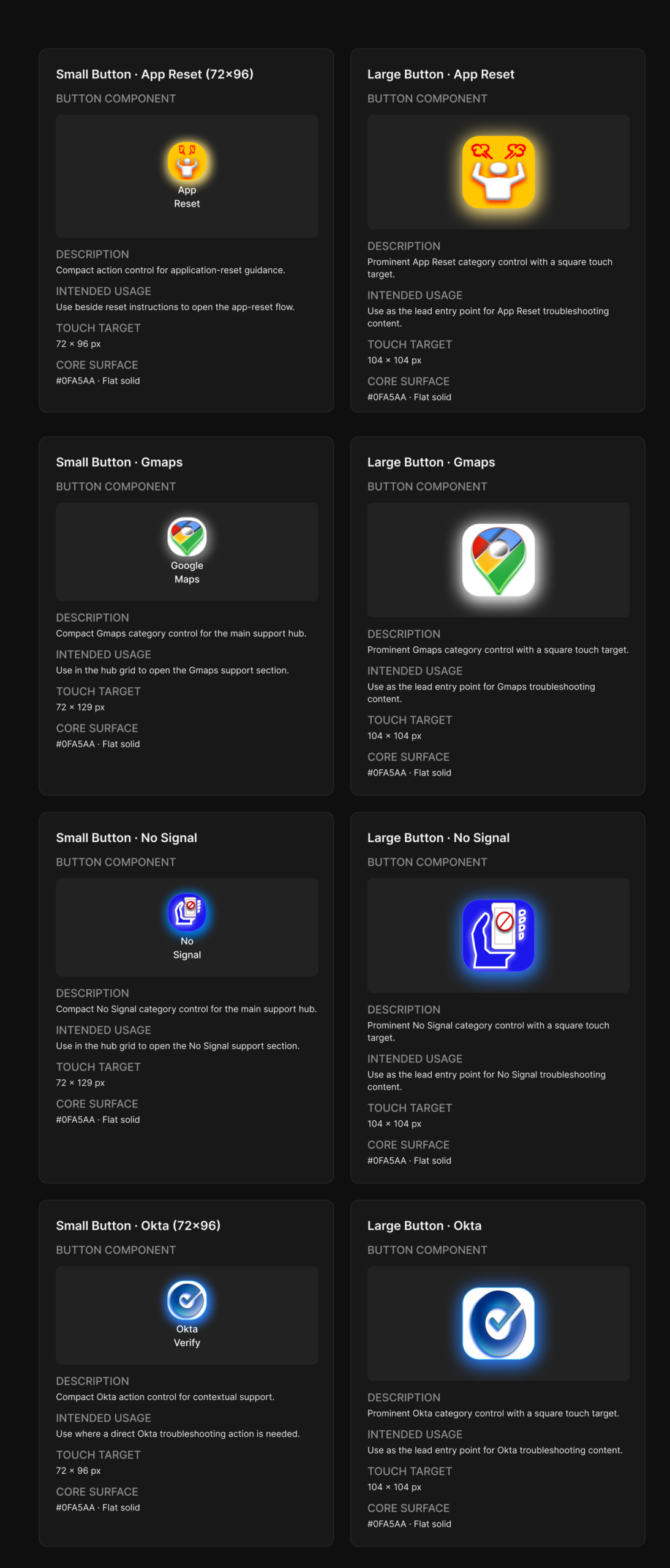
I was inspired by 3D looking buttons to help my app stand apart visually from the rest of the work phones' apps


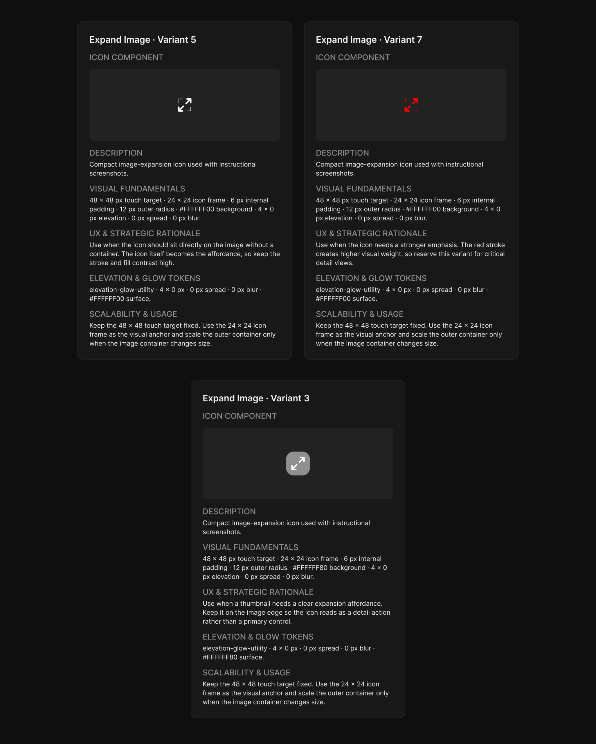
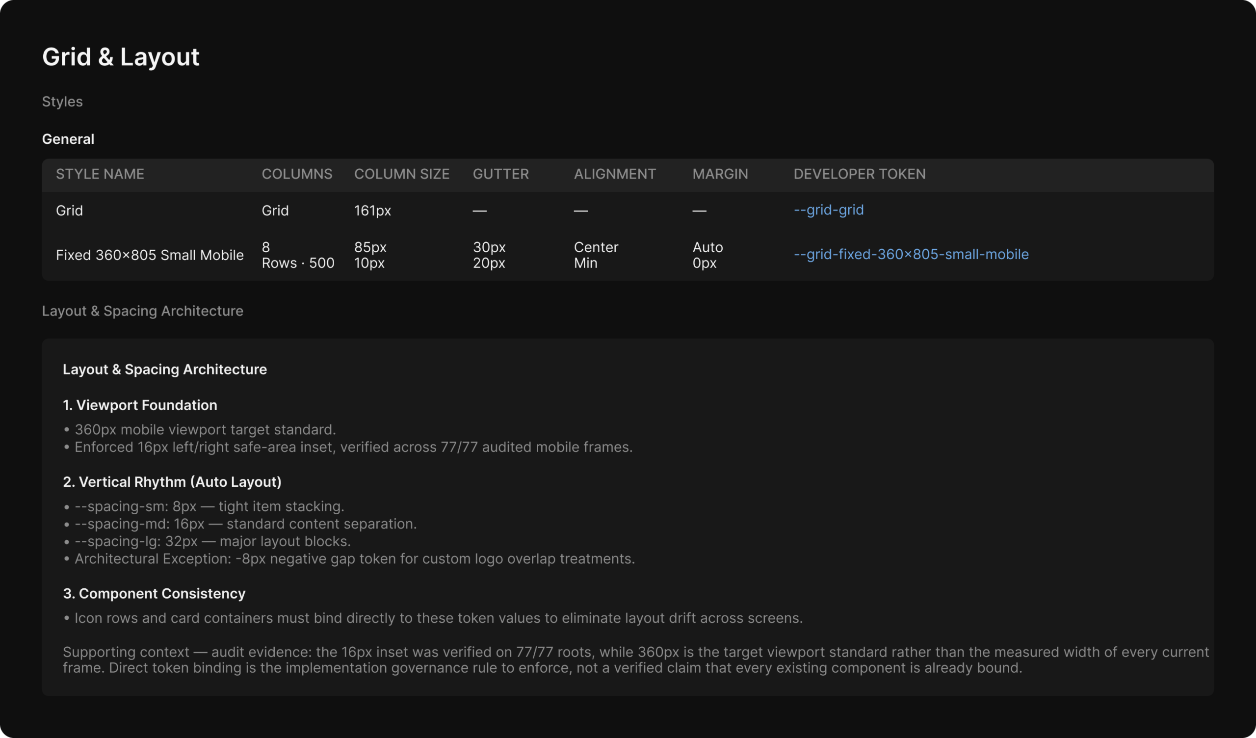
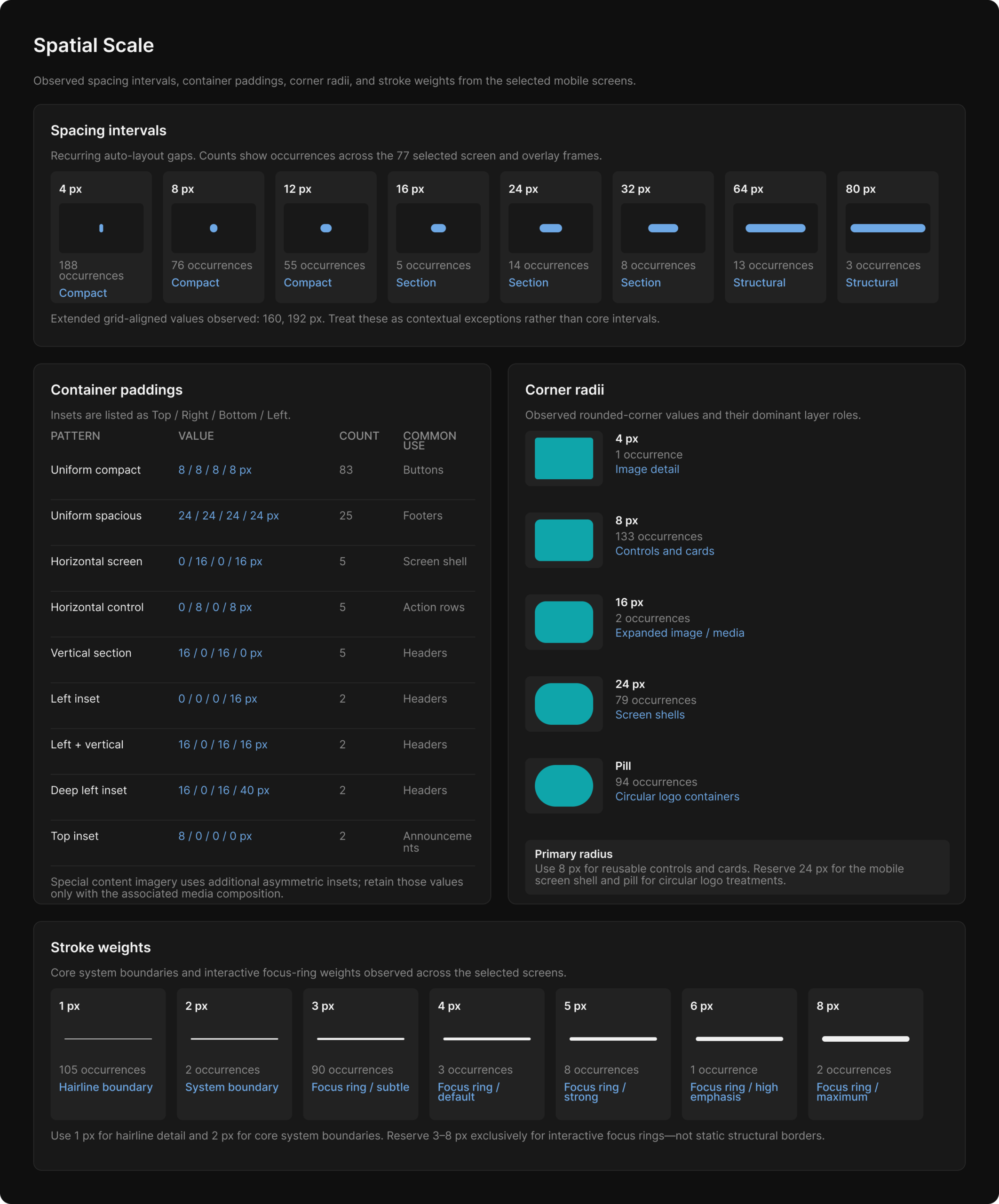
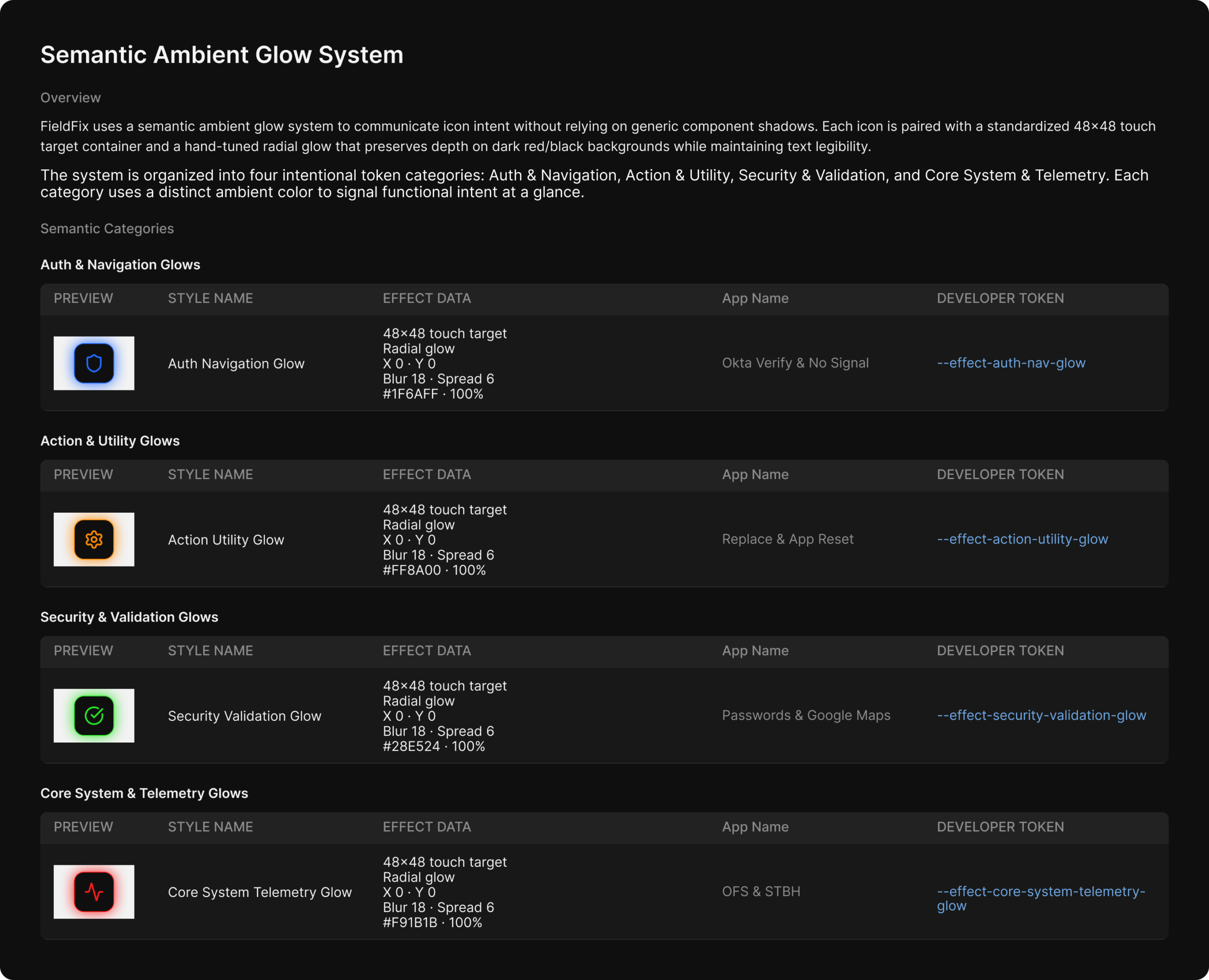
The asset collection
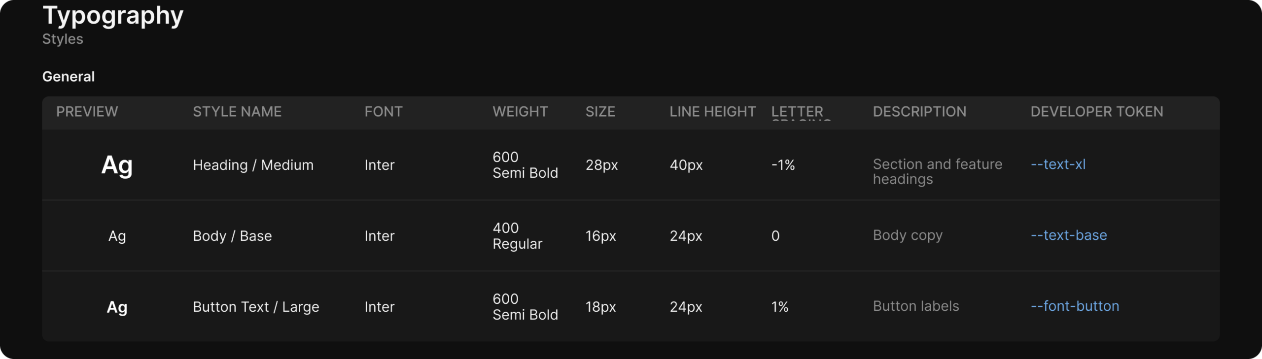
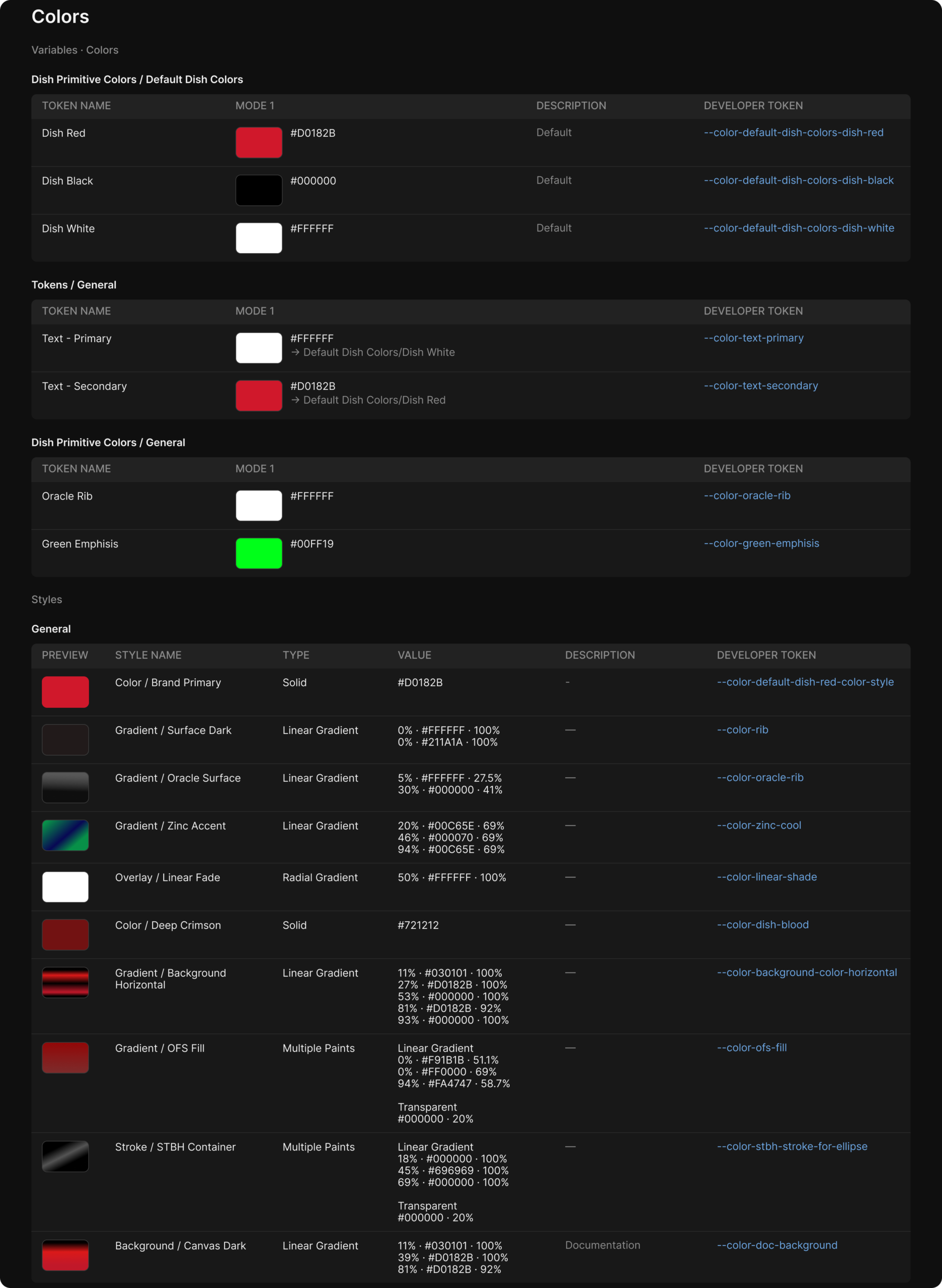
My design system relied heavily on creating componets and variables for different purposes in the app.
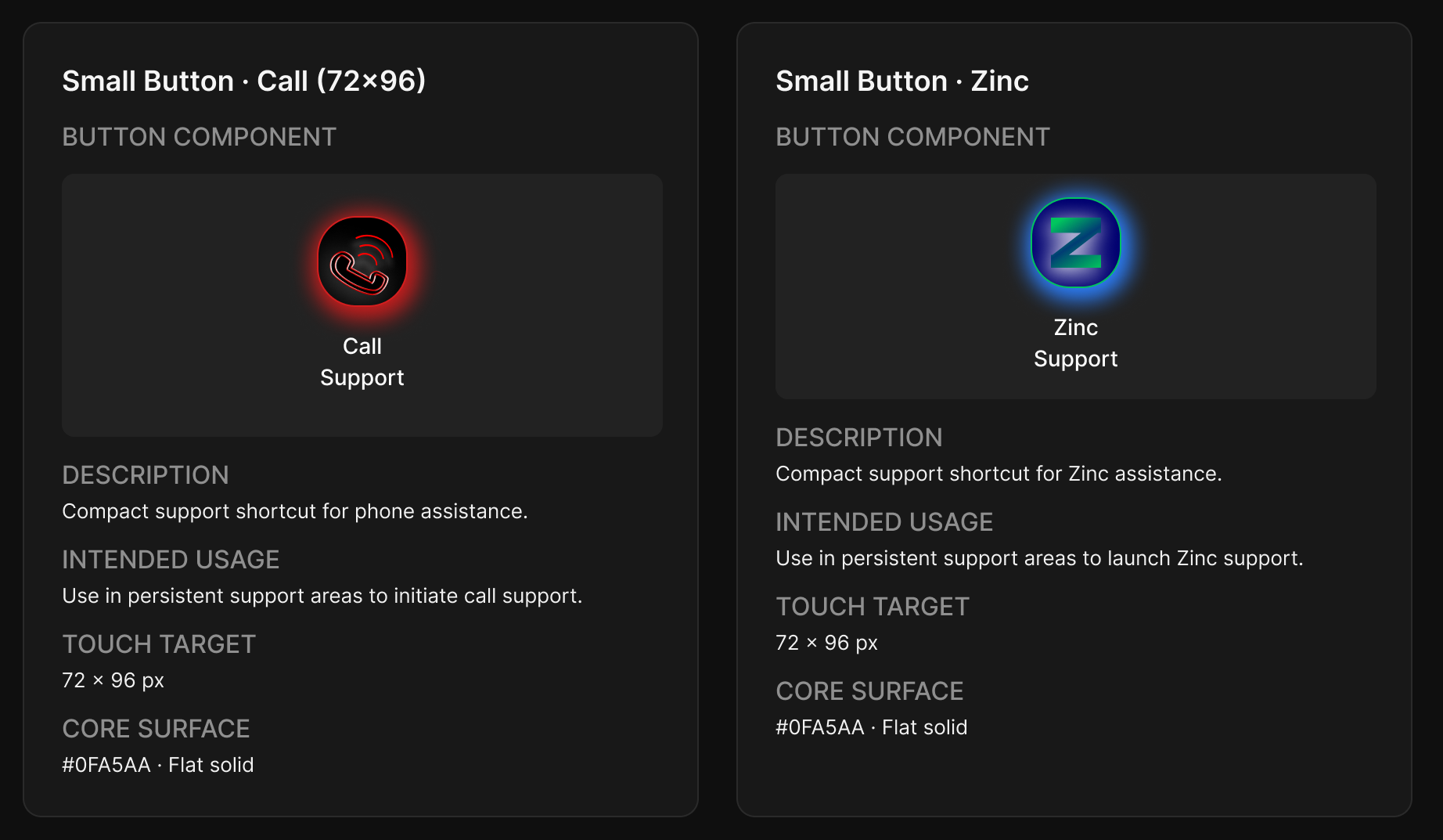
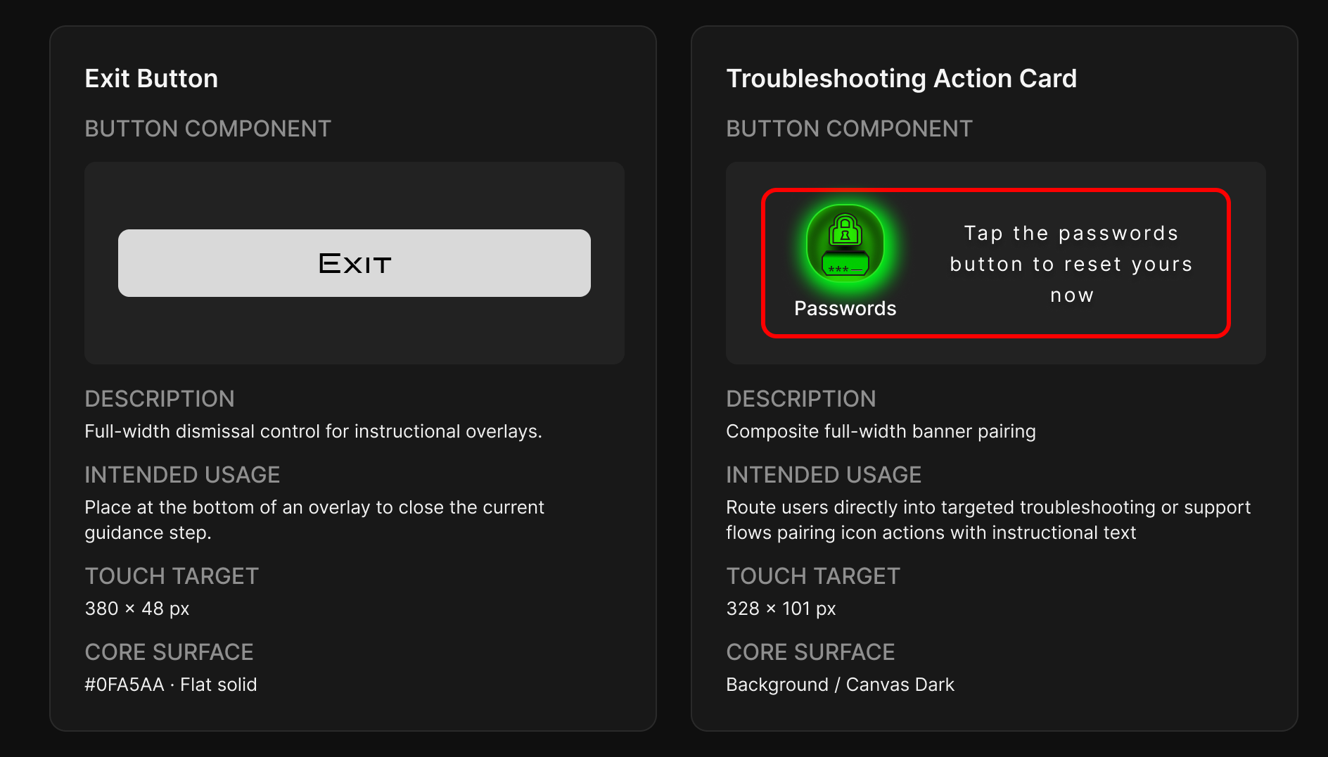
Creating the buttons
I created my buttons to be easily identifiable as well as memorable.
Minimal Text
-
Speeds up decision making
-
Reduces cognitive load during stressful installs
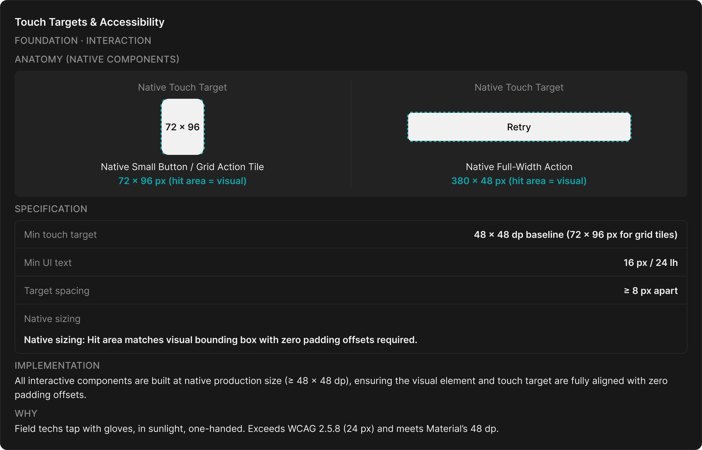
Large button navigation
-
Technicians often operate phones while standing or holding equipment
-
Large tap targets reduce input errors
App priorities & features
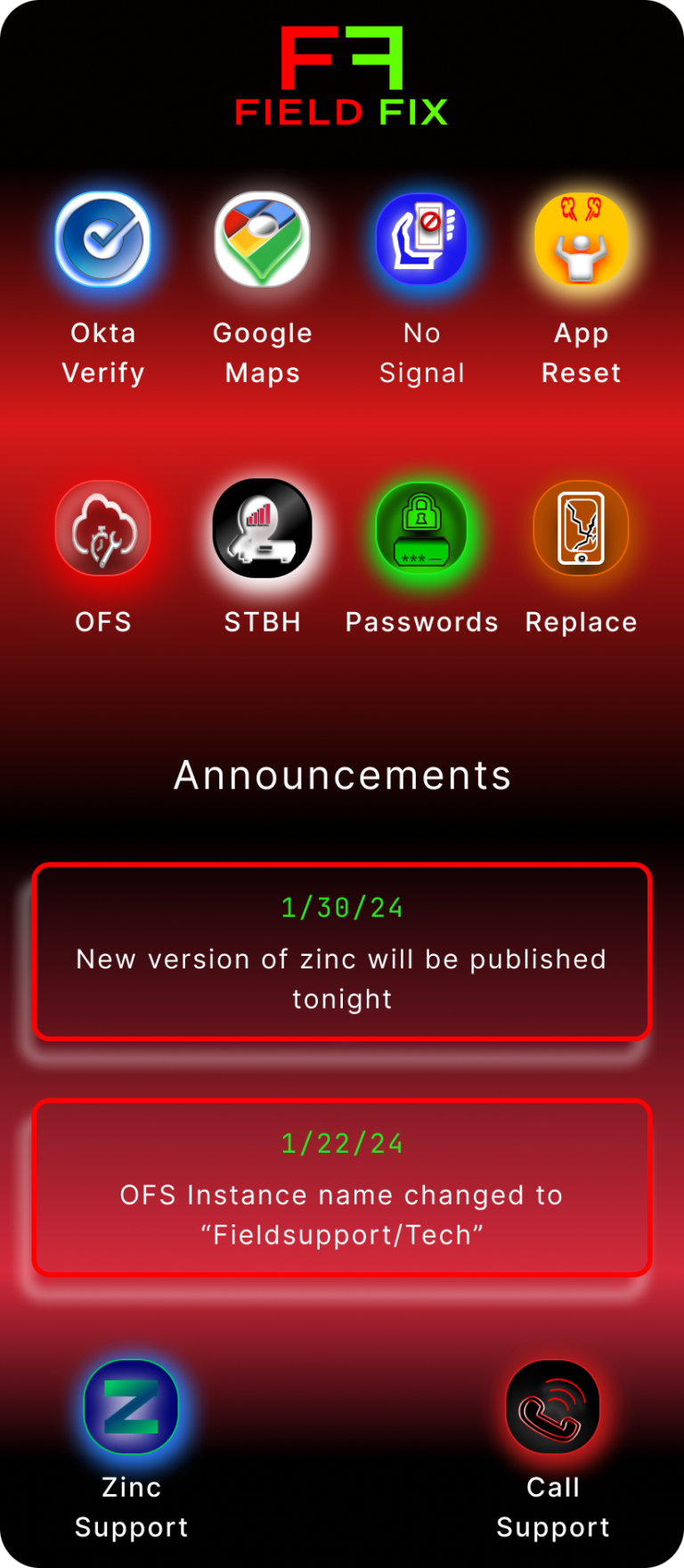
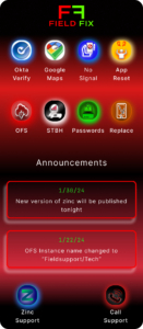
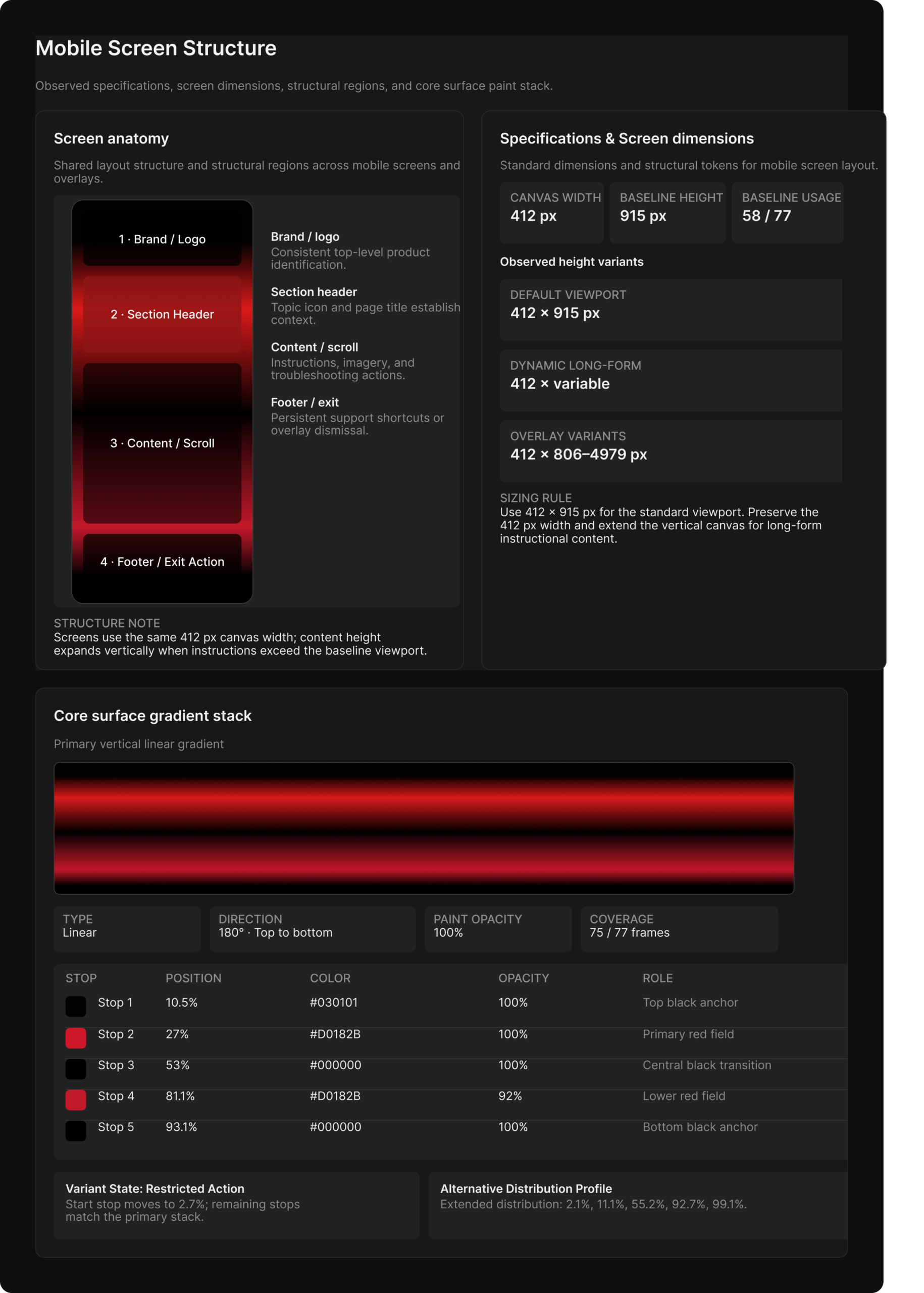
The troubleshooter app might be seen by customers so it was important to use company colors for uniformity
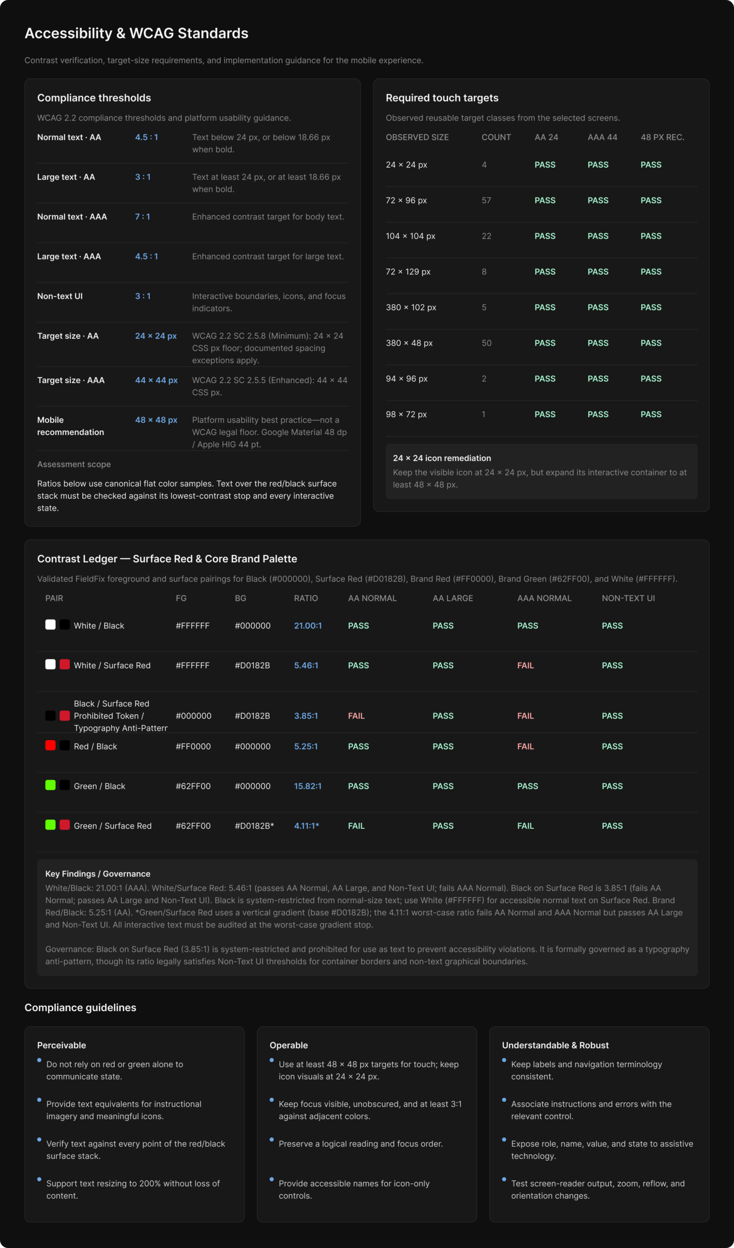
I incorporated high contrast colors for easy readability
Announcement section is intended for recent notifications that effect all techs
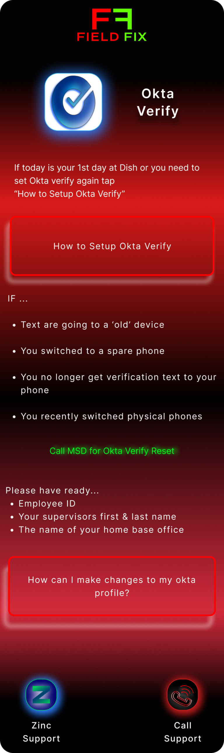
Buttons to call / text support are uniformly available on all pages.
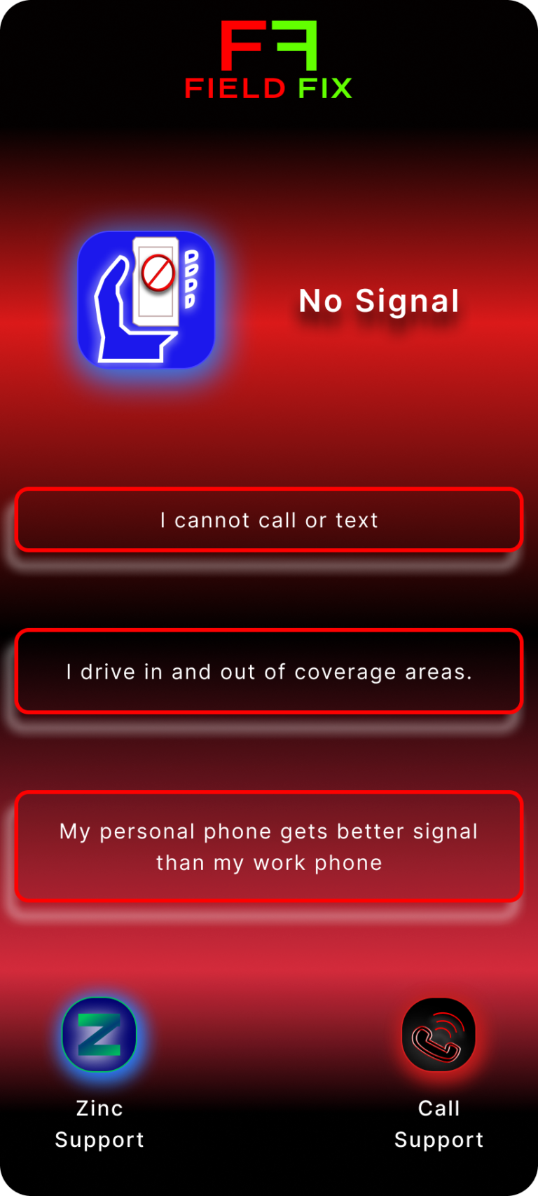
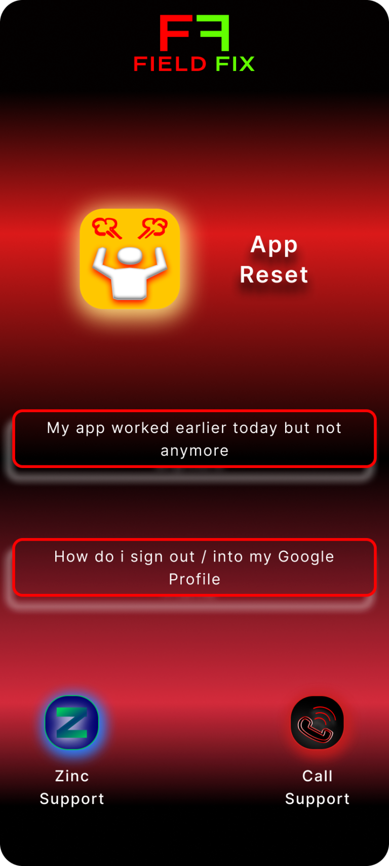
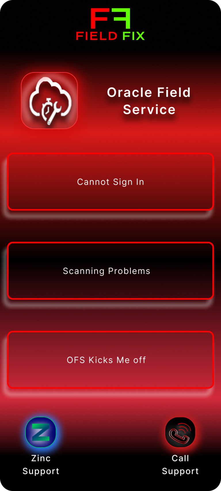
Each section page features the most common problems technicians call for support
Each problem is phrased the way technicians describe their difficulty
Important reminders are in green text for emphsis
Steps are accompanied with pictures highlighting key points of the page on the tech’s phone
If the problem has multiple solutions the framed area acts as button that will take the user to the page that details the solution throughly
Future Iterations
-
Voice-activated troubleshooting to allow technicians to search for solutions hands-free while actively working on equipment.
-
Expanded troubleshooting library with additional common problems and step-by-step solutions based on frequently reported support tickets.
-
Technician collaboration tools that allow techs to share solutions, notes, or tips with other technicians in their region or team.
- Usage analytics for support teams to identify which troubleshooting paths are used most often and where additional training or documentation may be needed.
What I learned
Designing this app pushed me to teach myself the fundamentals of Figma while exploring how digital tools can be used to solve real operational problems. Through conversations with technicians and observing the types of issues that frequently lead to support calls, I gained a deeper understanding of the troubleshooting steps that matter most in the field. This experience ultimately motivated me to pursue the Google UX Design Certificate so I could better understand the design process and continue improving how I approach problem-solving through design.