































Type

Rebrand & Redesign

Role

Designer & Developer

Platform

Mobile device

Design Tools

Figma & Chat GPT Plus

Duration

4 Months

A family owned scuba diving and fishing business in Belize engaged  me to explore a full rebranding for their company. New name, logo, and a modern reservation system. I aligned this opportunity with my UX Design certification coursework, allowing me to apply real world challenges to an academic project.

The Initial Need for Redesign

Competitive Landscape

My client aimed to modernize her online presence and gain a competitive edge by introducing a mobile first reservation system transforming his inefficient phone- and email-driven process into a seamless digital experience.

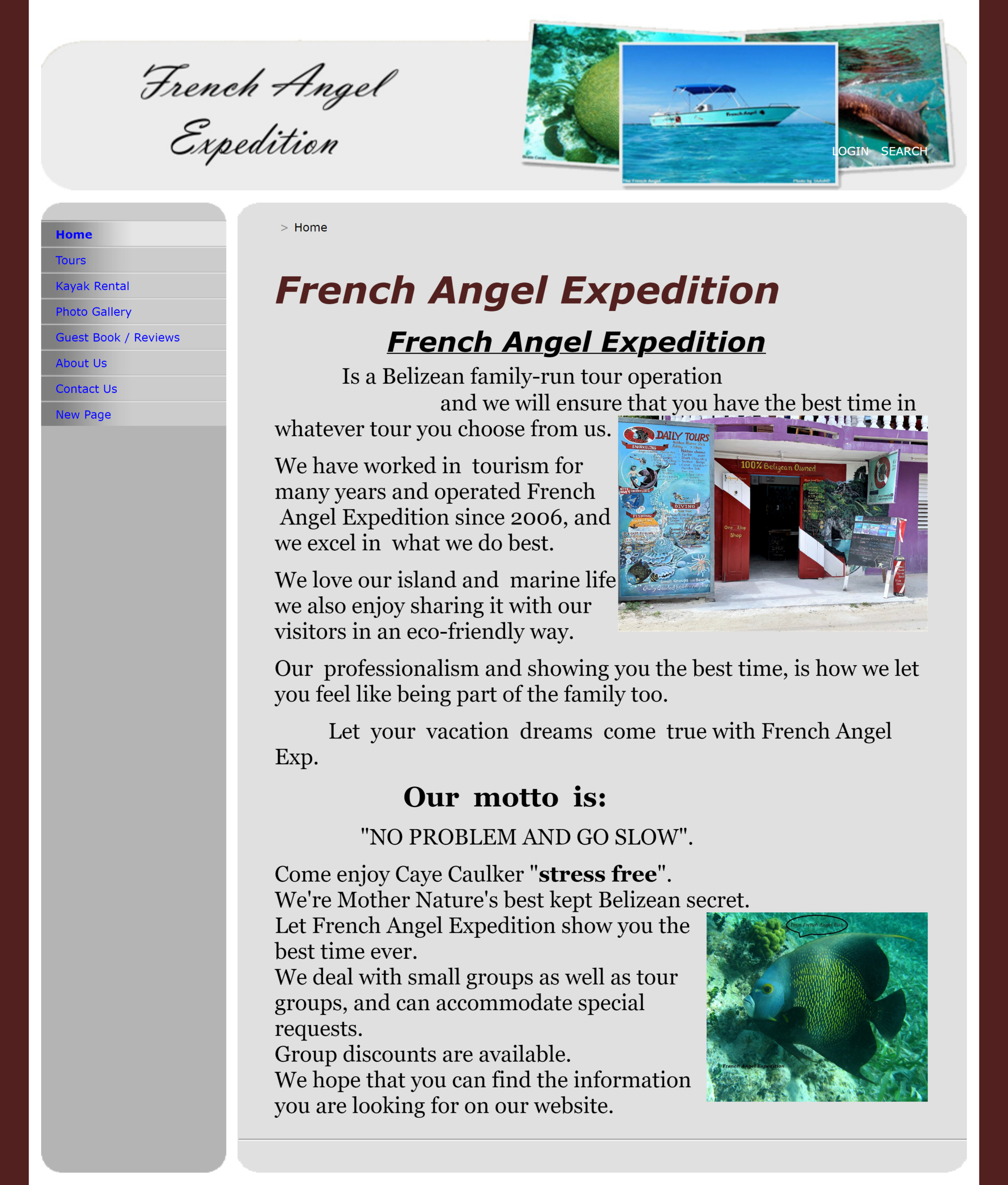
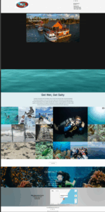
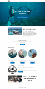
The original site was over 20 years old, had zero mobile device capability, which no longer reflected the quality or personality of the business. This rebrand aims to create a modern platform that supports mobile / online reservations and payments; it would be 1st in the region to have a mobile 1st design.

www.frenchangelexp.info_homepage.aspx(iPhone 16)

A Sea of Sameness

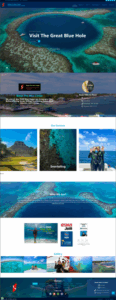
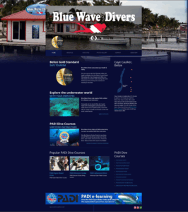
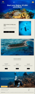
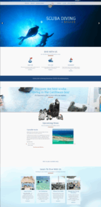
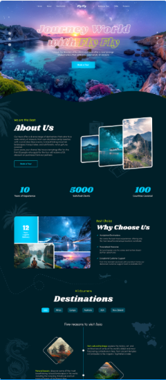
I conducted a visual and functional audit of the major dive companies in the region. The findings revealed a market of desktop 1st websites with similar ‘blocky’ layouts.

Aesthetic Direction

Inspiration

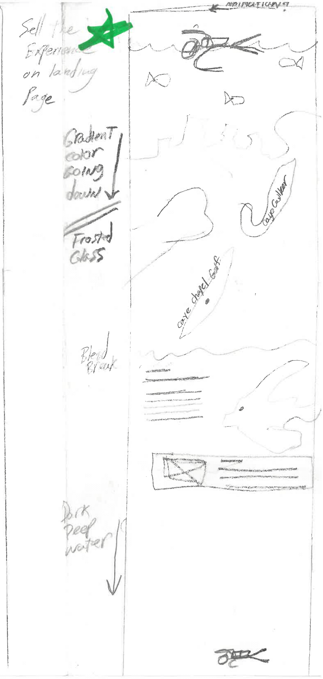
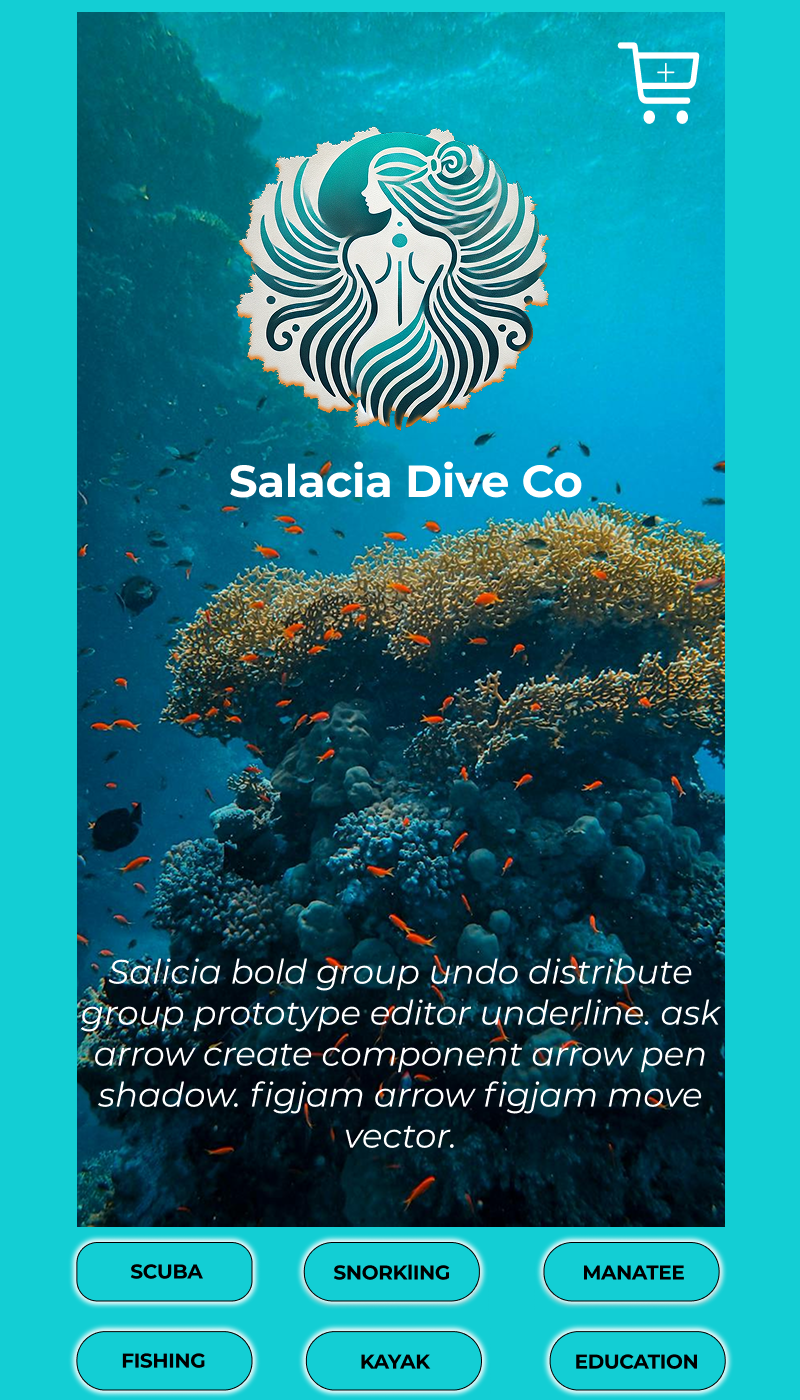
The environment is one of the main attractions to Belize. It was important to create a immersive and beautiful mobile experience that mirrors the beauty of the environment and make my design stand apart from the competition.

Logo Ideas

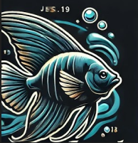
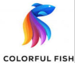
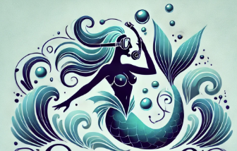
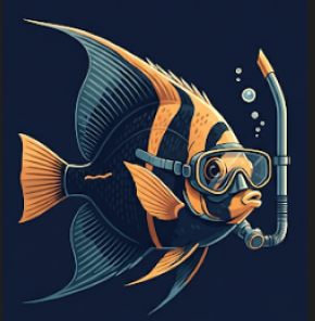
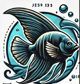
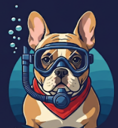
With the name ‘Salacia’ already established, I set out to modernize the brand’s identity. My process involved researching competitor designs and leveraging AI to generate creative iterations. The final direction was a tribute to both the Roman goddess of the sea and the client’s original fish-themed logo.

Color

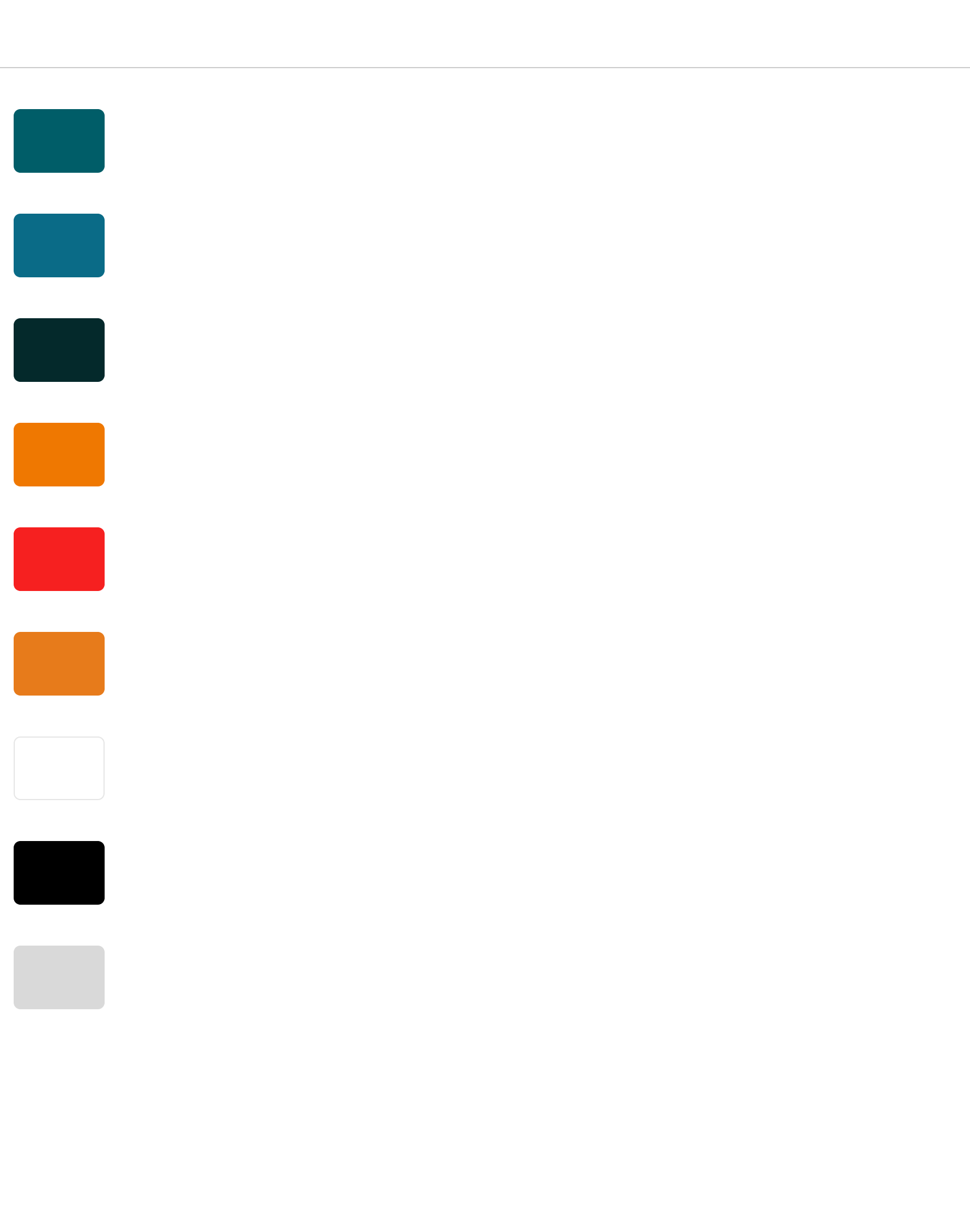
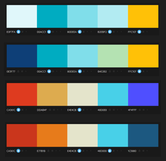
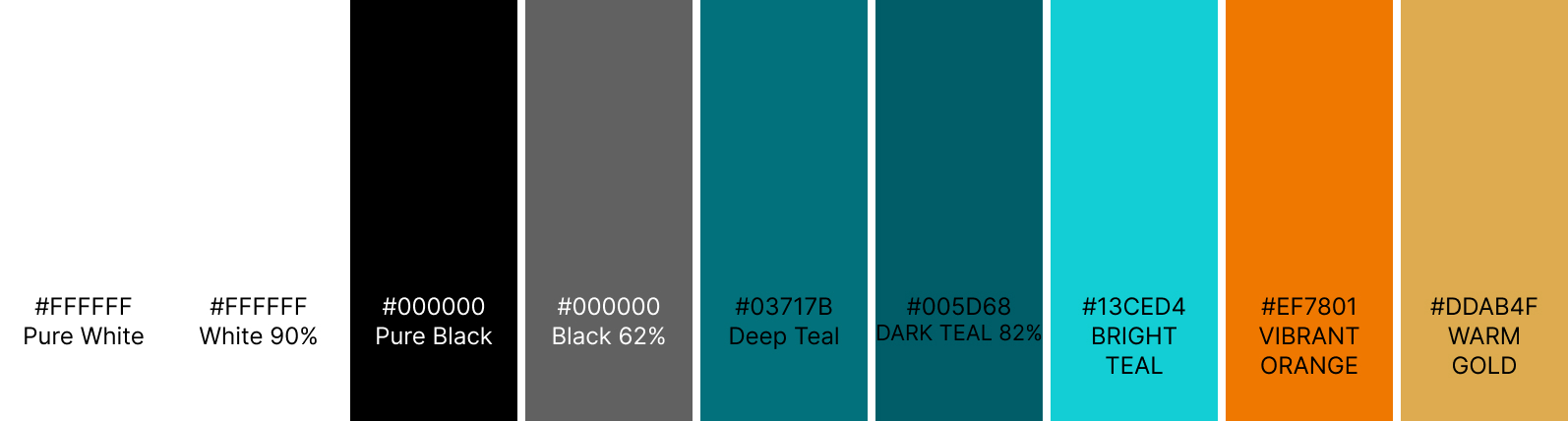
I considered several color combinations for the app with the colors of the environment squarely in mind.

Understanding the user

User Research

Personas

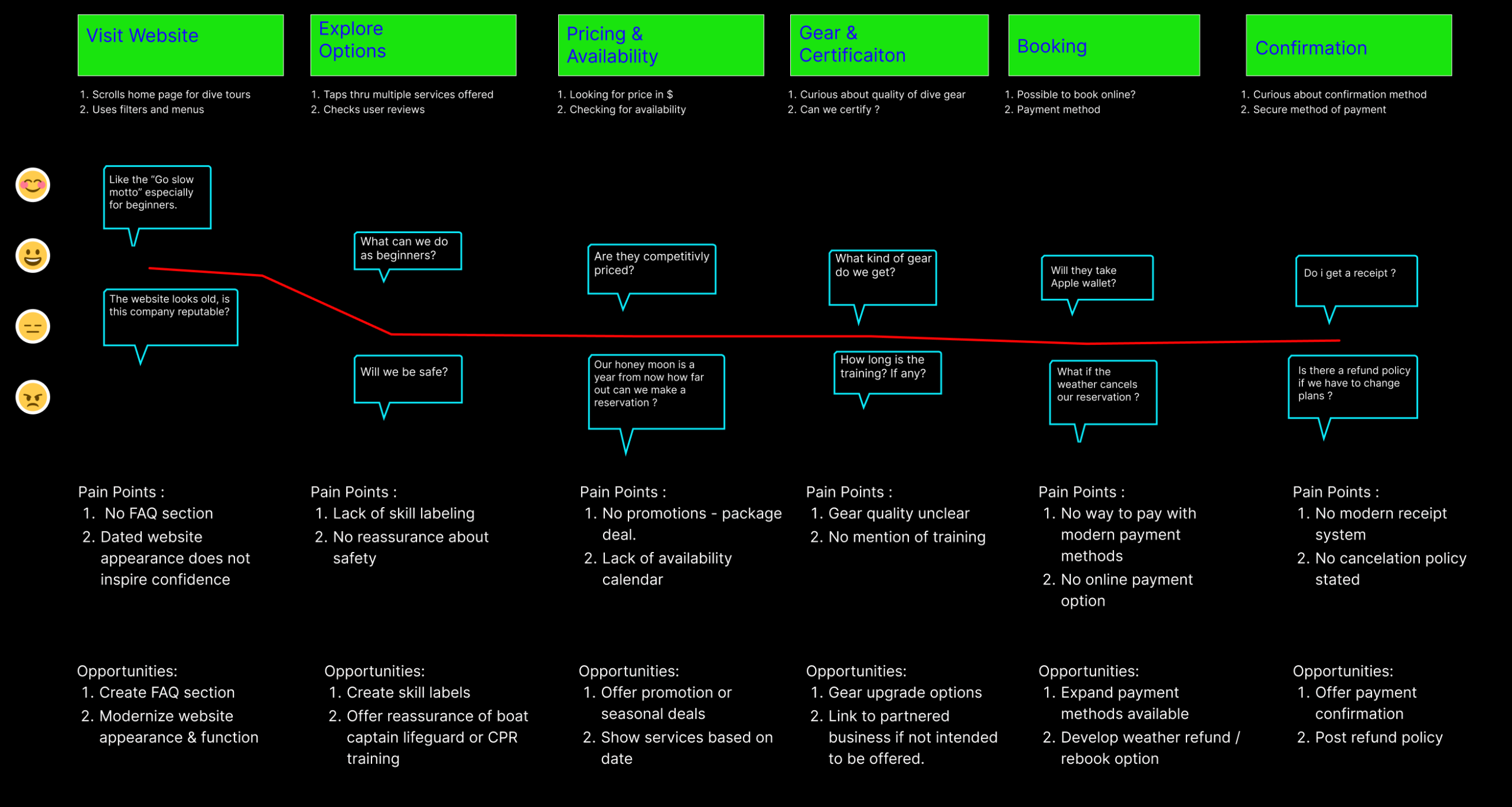
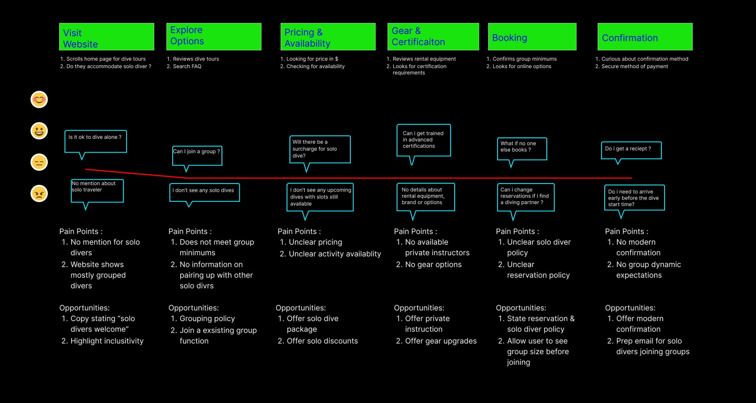
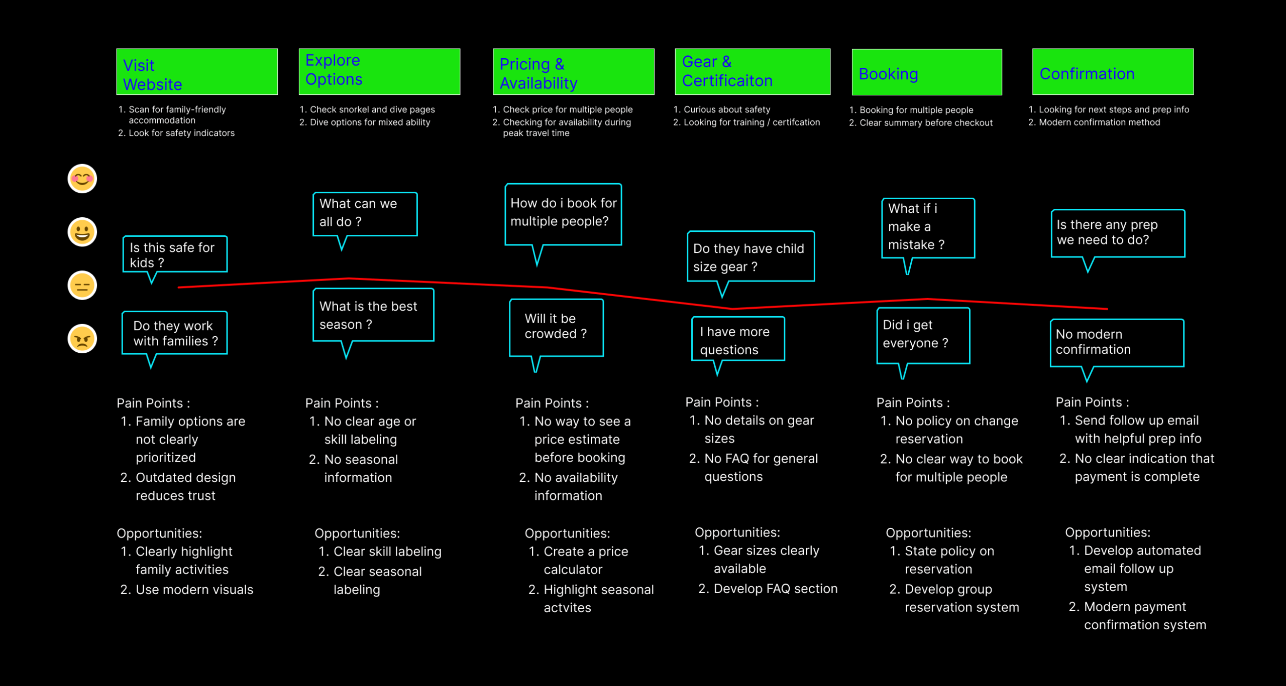
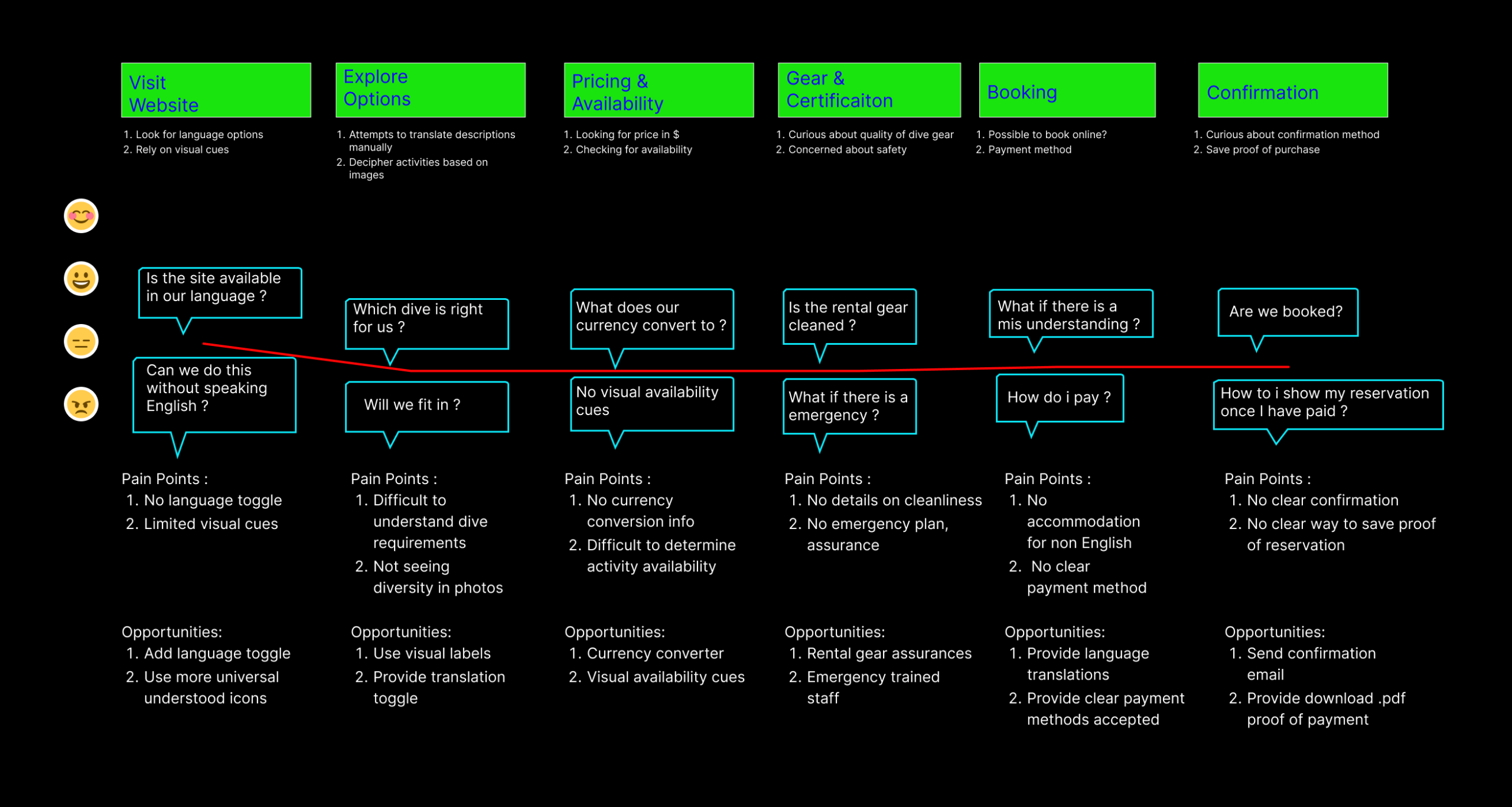
Pain Points

Scope & Structure

Given Salacia’s location is an international travel hub, a variety of five distinct personas were identified. These personas represent the range of ages and dive experience from the cautious traveler to the seasoned expert.

Experienced couple booking a multi-day dive adventure.

" We can't wait to dive ! "

Goals

Explore unique dive sites

Book tours and gear online

Maximize time in the water

Frustrations

Group minimums

Text is unorganized on page

No payment method info

No prior diving experience, newly weds on honeymoon / vacation

"We have always wanted to learn to scuba dive "

Goals

Try something new safely

Clear guidance & training

Beginner friendly options

Frustrations

No Certification requirements

No safety assurance

No cancelation policy

A solo diver seeking Belize’s best dive spots and fellow adventurers

" I have always wanted to see unique Belize "

Goals

Explore unique dive sites

Dive solo or small groups

Comfortable for solo diver

Frustrations

Lack of pricing for solo divers

Unsure of grouping policy

Condition of rental gear 

A family seeking a safe, memorable dive trip that fits all experience levels

" Looking forward to family fun"

Goals

Make memories together

Dive tours for mixed experience levels

Make most of limited vacation time

Frustrations

Dive tour skill level not clearly labeled

Schedule conflicts with other activites

Quality of rental gear 

A non-English speaking couple eager to dive in Belize, relying on visuals and translated support

" No English "

Goals

Easy translation into native language

Currency conversion

Confident in proof of reservation

Frustrations

Unclear pricing 

Chosing right experience

Fear of booking wrong date

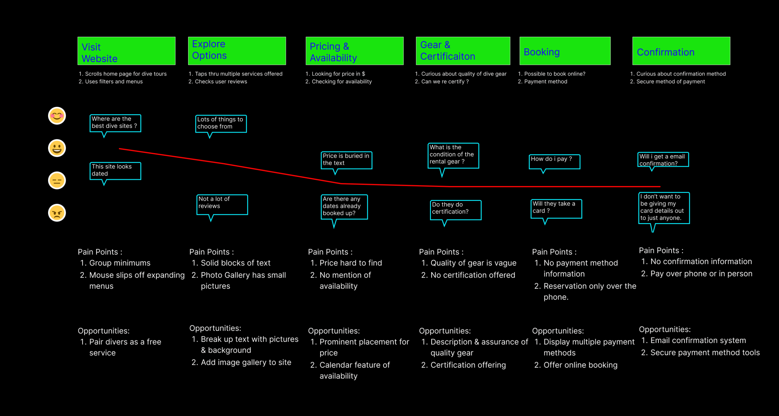
Pain Points

Legacy Booking

Customers can only make reservations or get further information via phone, email, or WhatsApp. This limits after-hours bookings, obscures real-time availability, and creates an inefficient workflow for staff.

Uncertainty

No clear labeling of required diving experience, seasonal information, language options or refund policy for website visitors leading to hesitation.

Trust

Inconsistent information formating, outdated visuals, mixed typography and the absence of modern reservation system reduce user confidence, inspiring the customer to look for alternatives.

Structuring Ideas

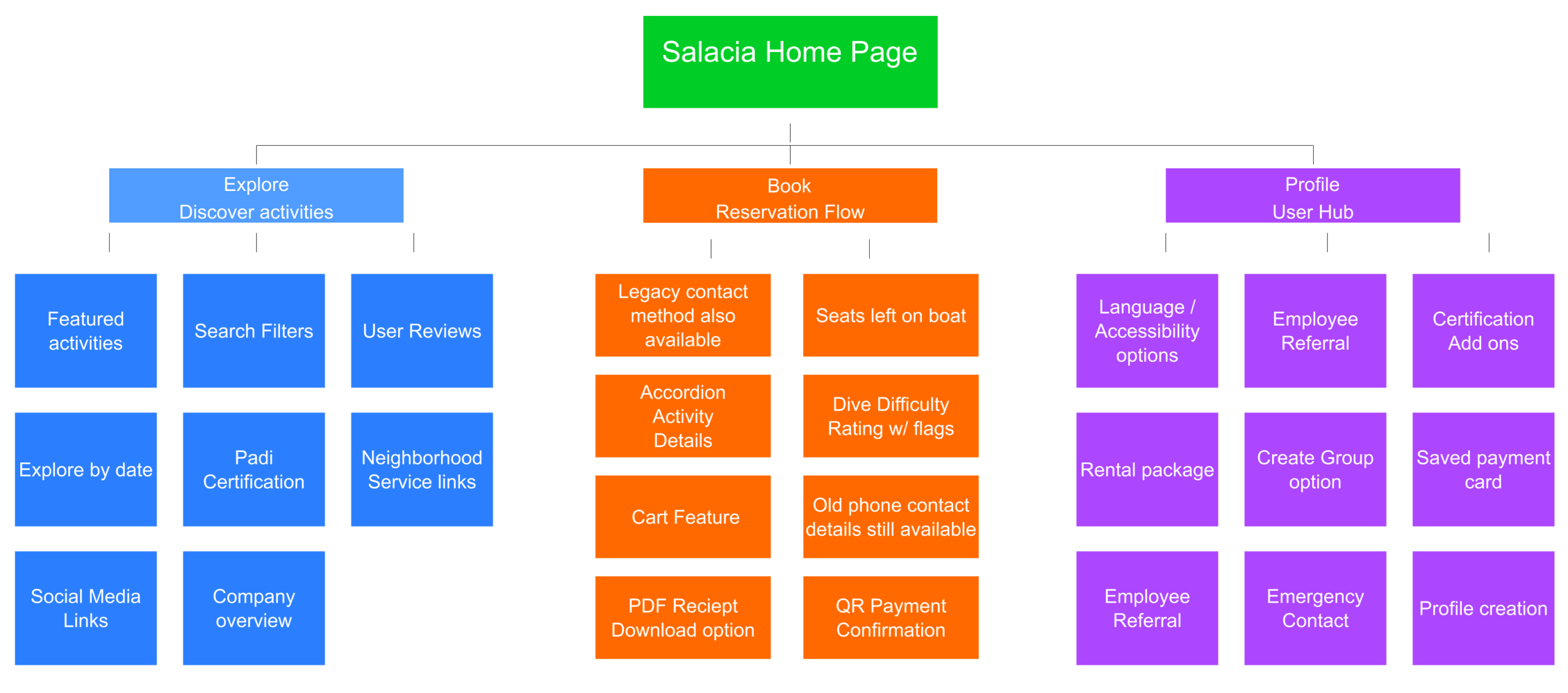
Once the needs of the user base were established, I started to organize application ideas. I decided to combine the key pain points and the desires of my client into 3 sections

Explore, Book, and Profile Management

Explore – Client wishes to showcase expanding services offered and provide clear labeling easing uncertainty.

Book – By offering a modern online reservation system the client can compete in the modern market and increase efficiency.

Profile – Adding a customizable profile allows users to have more of a custom fit experience gaining the trust of their customers.

My 1st priority was to establish the core function of the app, online reservations.

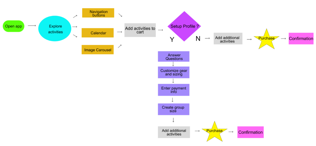
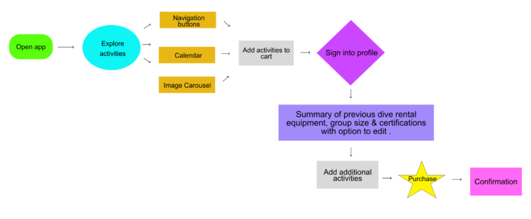
I created 2 user flows demonstrating how users could make a online reservation.

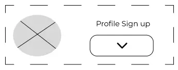
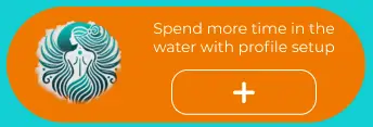
A profile feature was proposed as a way to help the business run more efficiently in early meetings with the client.  The feature would allow his business to prepare gear in advance allowing for  more time in the water for the customer instead of the shop but did not want to make it mandatory.

No profile flow (with option)

This flow shows the basic structure with a emphasis on exploration with an option to setup a profile.

1st time users are encouraged to explore all the site has to offer in a variety of different methods.  This allows the user to see there is more to simply scuba diving available.

The user is not forced to setup a profile and can complete a sale by simply adding in payment information before checkout . 

Established profile flow

This flow shows the basic structure of a user who has already setup a profile and is making a new reservation.

The user is able to customize their needs with preferences if needed and allows client to better prepare for customer.

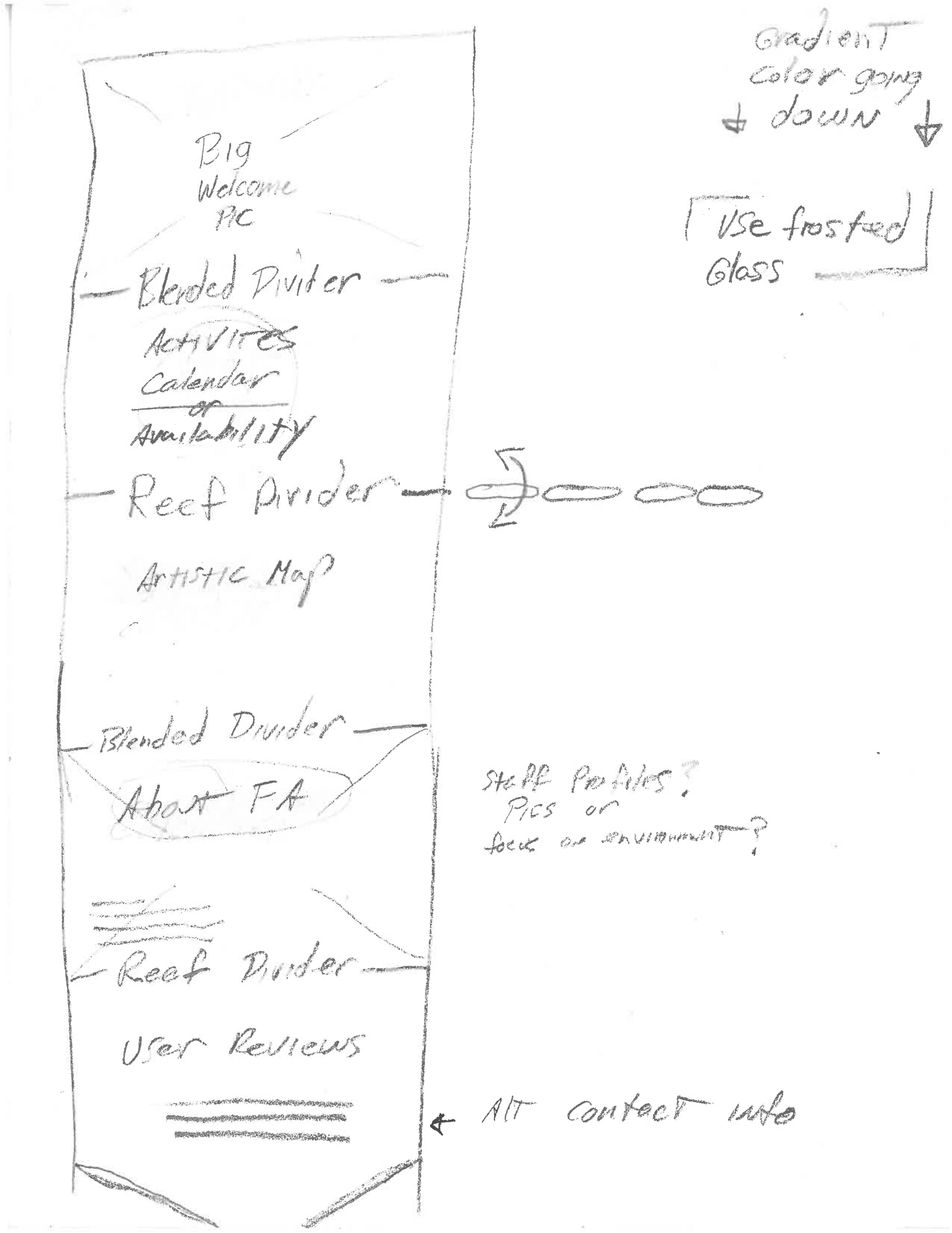
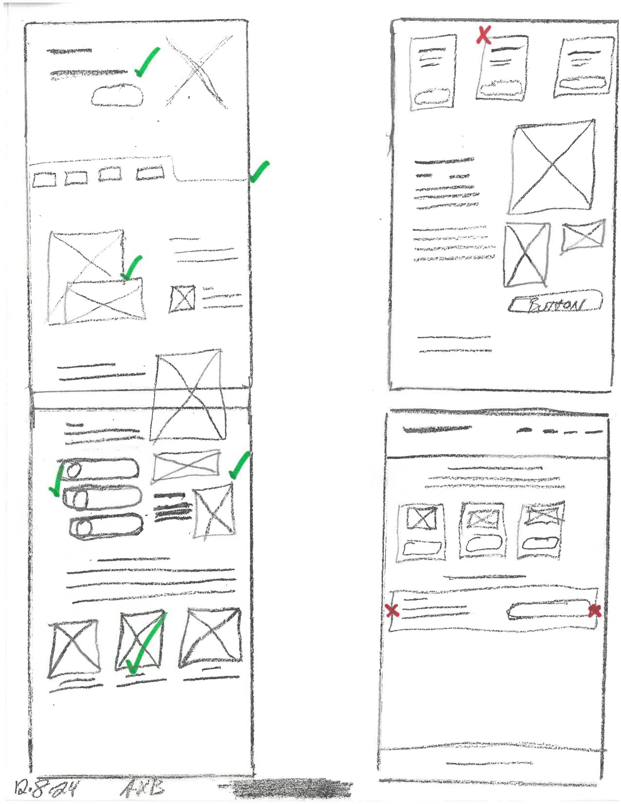
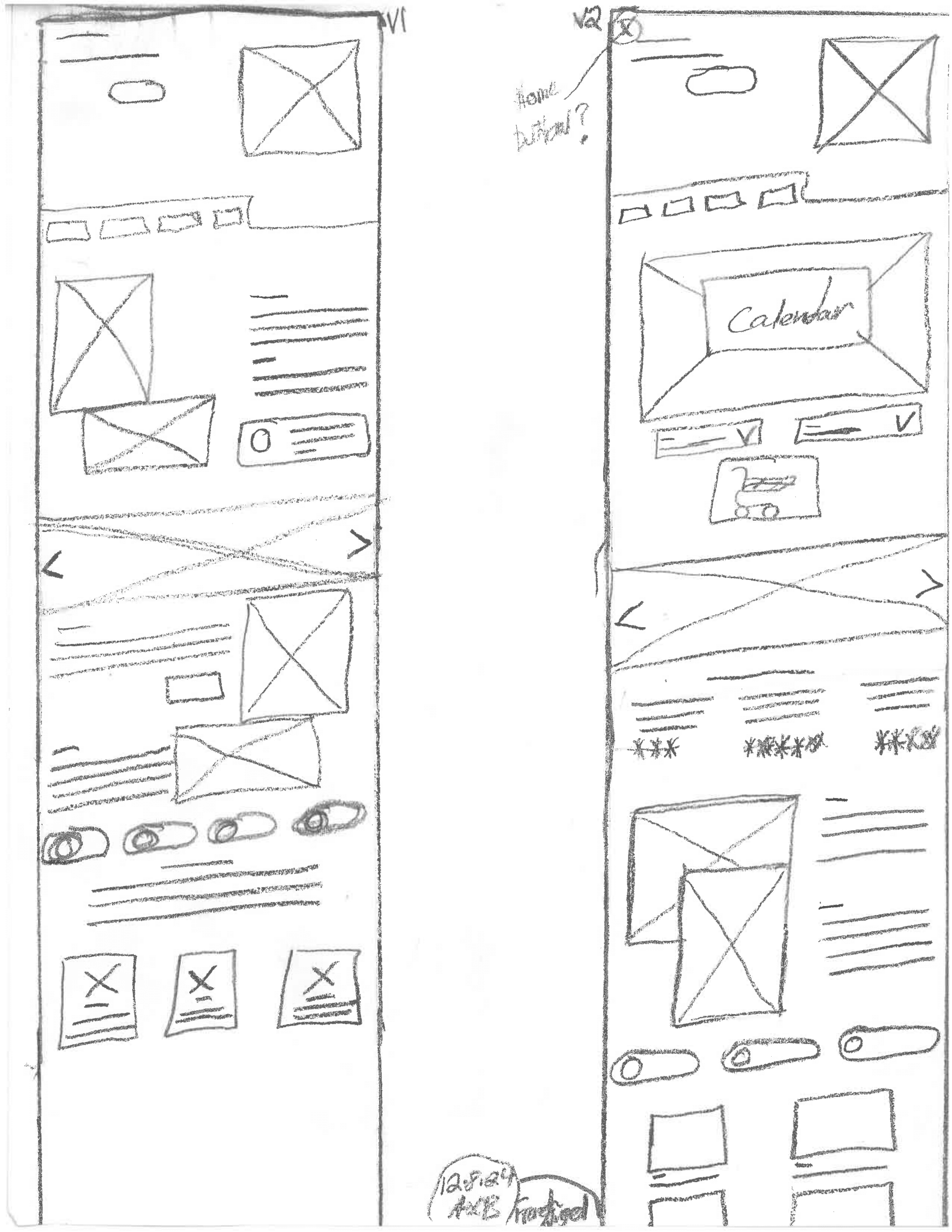
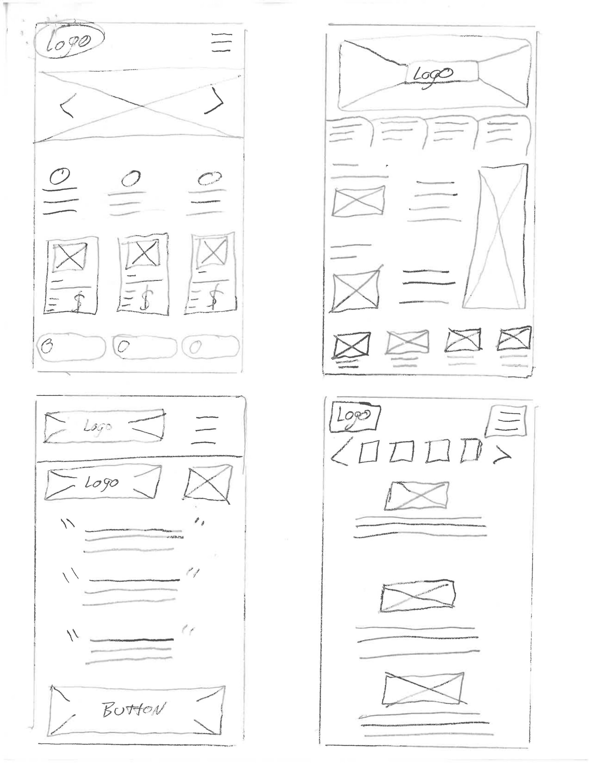
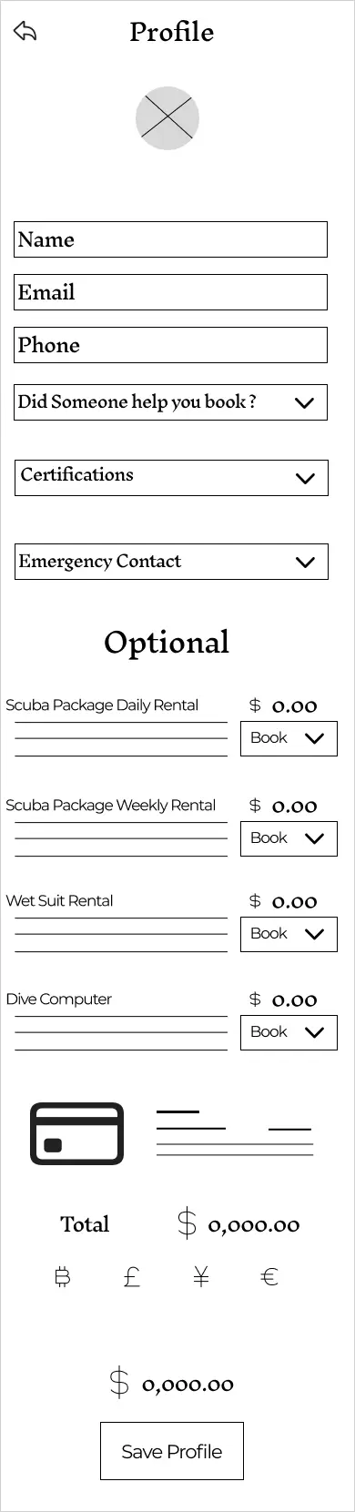
Low-Fidelity: Sketching the Concept

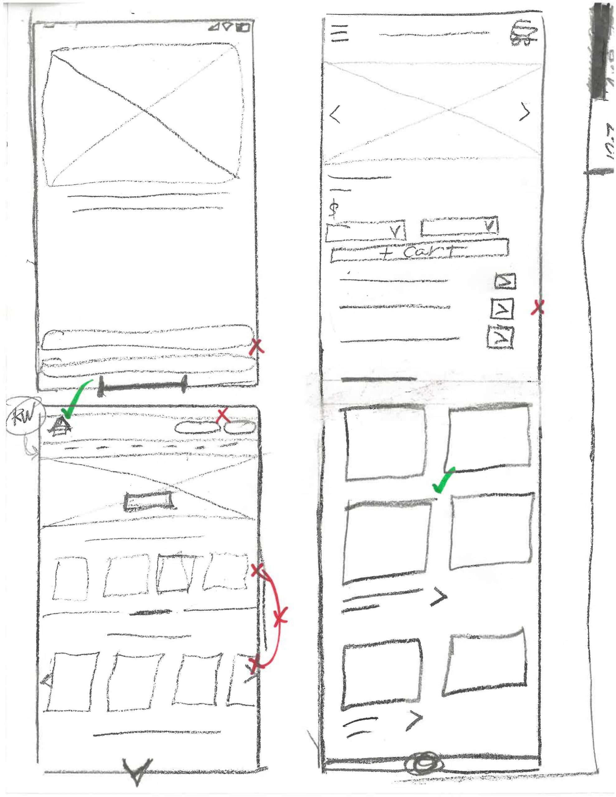
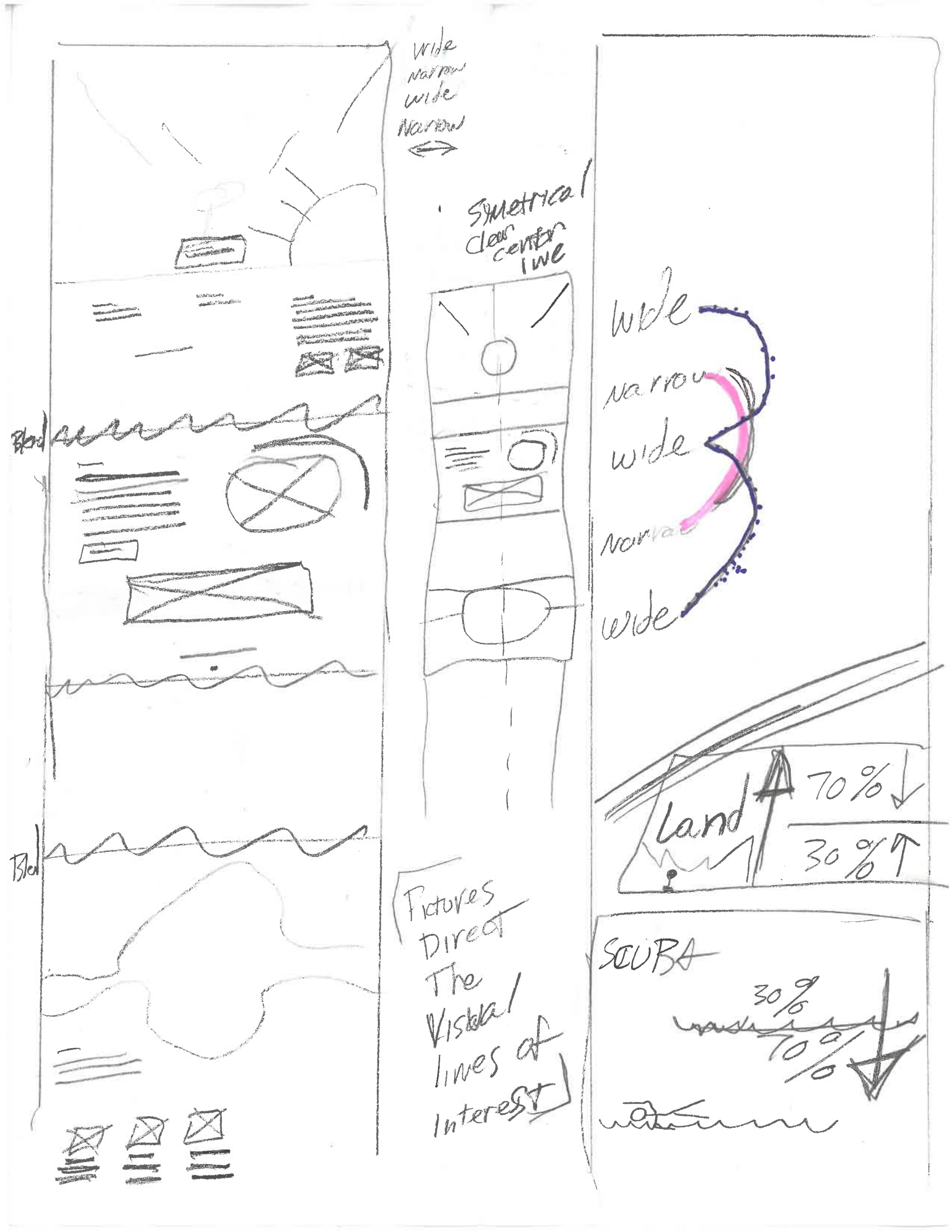
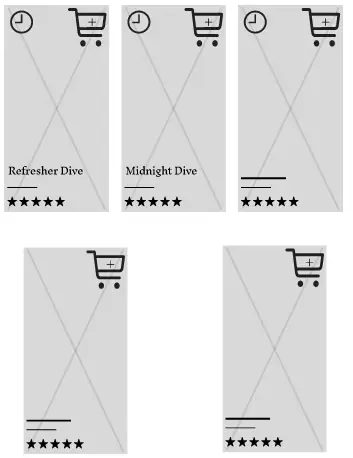
Paper prototypes allowed for rapid testing and iteration of the core features before committing to digital tools.

Based on the big pain points I focused on 3 questions for my 1st design.

There is overlap between the 3 and they all inform on one another. 

Explore & Navigation can user navigate the app and are they curious to see more ?

Profile will users be interested in using the profile feature?

Purchase can users make a final purchase / reservation?

I took the best from my wireframe iterations and summarized them into a digital wireframe prototype.

Usability Survey # 1 Digital Wireframe

The first round moderated & unmoderated usability survey was conducted with 13 participants.

The goal was to validate the core functions of the app. 

Moderated Studies

I recruited friends and family for moderated and unmoderated survey participants, which enabled direct observation of user reactions. I found that testing participants new to wireframes introduced interpretation challenges. This introduced confusion unrelated to the product experience itself and may have influenced certain data.

This experience reinforced the importance of participant preparation and awareness of participants’ technical familiarity when conducting usability testing.

In future iterations, I would provide clearer context and guidance before testing to ensure feedback focuses on the product’s usability rather than the testing medium.

I took what i learned and made improvements to my design and began work on the hi fi mockup.

In a production environment, I would have conduct additional rounds of wireframe-level testing, however the Google Design course moves directly into Hi Fi prototype as the next iteration.

Results

Navigation / Exploration
Navigation : 11 out of 13 could navigate the site but some with difficulty
Exploration : 11 out of 13 said this is a scuba site they would use to book a scuba vacation and enjoyed small features found within the app
" Seats left on the boat notifier and number of people looking at the activity is a great addition "
Moderated survey comment
Profile
Profile : 10 of 13 found the profile section but 3 had difficulty representing a significant amount

Some users did not wish to setup a profile to avoid the hassle.

"I don't want a profile, I just want to check out"
Moderated survey comment

Other users saw the potential for a profile and even had useful suggestions.

Logging into a profile would be useful to me, I could see what I have booked, access my QR codes, edit existing bookings, and review completed experiences.

Unmoderated survey comment

Purchase
Purchase : 69% could add a activity to the cart but some with difficulty
Purchase : 10 out of 12 could find the cart and make a purchase however users also expressed concern about booking flow
User data gave conflicting results.
" I'm not sure all the trip info is needed in the cart "
Moderated survey comment
" Really makes me feel confident to see all my information in the cart. "
Moderated survey comment

Key revisions upon results

Since the profile is a core feature of the app, I updated its color, placement, and label to make it easier to find and understand.

Usability insights showed that core actions needed to appear above the fold. This approach still welcomes first-time users while allowing returning users to quickly access what they need without extra steps. 

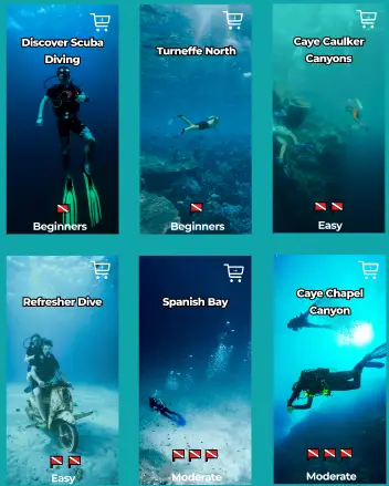
Several users were unclear regarding dive difficulty labeling.  Reordering the activities from beginner to advanced, and adding explicit labels, created a more intuitive progression.

I prepared a second round of usability surveys and gave my survey more context and alerted survey participants to limitations and assumptions in this prototype.

"For demo purposes, only "Midnight Dive" and "Refresher Dive" activities will appear in your cart."
Survey round 2

Digital wireframes were converted into a hi fi prototype and a second round of studies were shared with friends, family and the Google UX design group.

Usability Survey # 2 High Fidelity

Usability Survey Round 2

Task 1 Navigation : I asked participants to revisit their interest in exploring different dive activities and see if the updated flow made it easier for them to find activities and navigate in general.

Task 2 Profile : In this round, we also asked users again about their interest in setting up a profile, to confirm that the new design made this feature clearer and more appealing.

Task 3 Users : We included a few questions about age, gender, and device usage to better understand who our users are and how they interact with the app.

Survey results 26 unmoderated user surveyed

Round 2 focused on validating whether the improved organization, clearer labeling, and prominent profile features addressed the issues discovered in Round 1. These tasks were selected to confirm whether the design changes successfully improved user understanding and engagement.

The survey also provided new insights about who are users are, concerns about legibility and more of their comments.

Navigation and exploring

In Round 1, several participants expressed uncertainty about activity types and difficulty levels, so Round 2 focused on confirming whether the redesigned structure improved clarity and discovery.

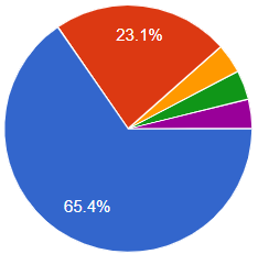
65.4% of users could determine the difficulty of different dive activites

Users are overwhelmingly interested in exploring different activities offered by Salacia

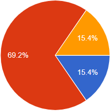
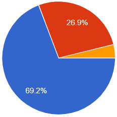
15.4% found website navigation very intuitive

69.2% said navigation was easy enough

4 participants (15.4%) reported that navigation was still confusing after round 2.

Profile

Users in Round 1 offered mixed responses about whether they would use a profile feature. Since the profile feature was a priority of the client it became a more prominent and refined part of the updated design, Round 2 re-evaluated user interest to verify whether the clearer placement and labeling made the feature more valuable and intuitive.

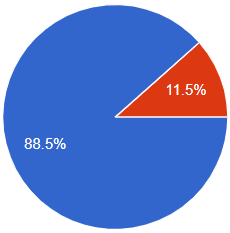
69.2% of users are interested in saving time by setting up a profile and having more options. 

One user (yellow section) was concerned about profile / payment cart security.

There still exists a section of potential customers who should not be ignored and equally served even if they don’t use the profile feature.

Legiablity

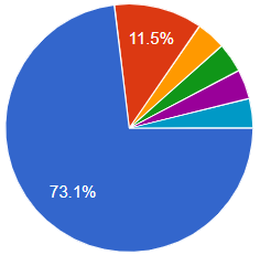
73.1% of users could read all text and button labels.

However several users mentioned a need to refine spacing and sizing.

"Some buttons feel oversized, and the spacing between the text and button borders is inconsistent."
John Doe
Designer

Who

In Round 2 to better understand who was testing the prototype and how they typically access similar apps. This helped contextualize the feedback and ensured that the design decisions aligned with the needs of actual users,

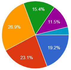
We had a wide range of user participants age.

57.7% of users surveyed were women

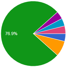
76.9% of users were new or learning scuba for the first time.

What device ?

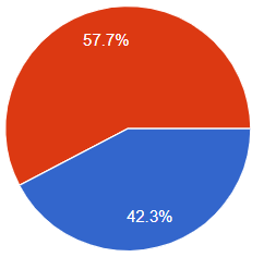
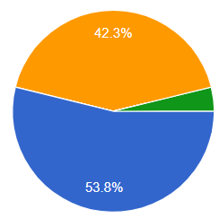
53.8% of users prefer Mobile phone to book their vacation with 42.3% who use desktop as their primary device.

Users also commented

Design System

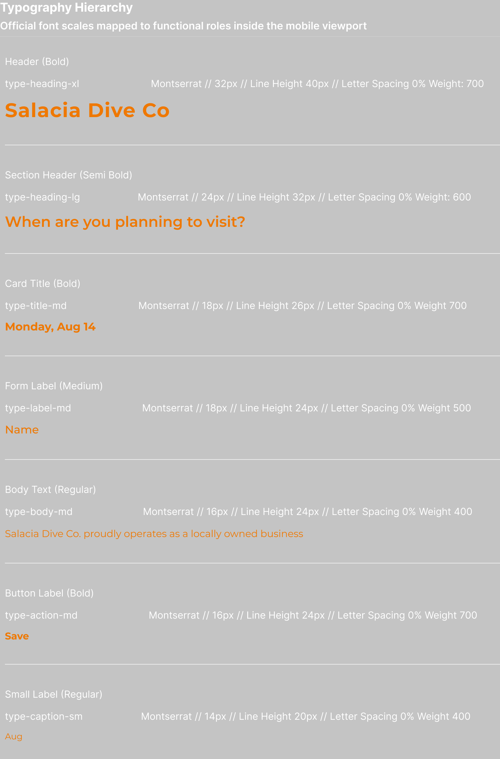
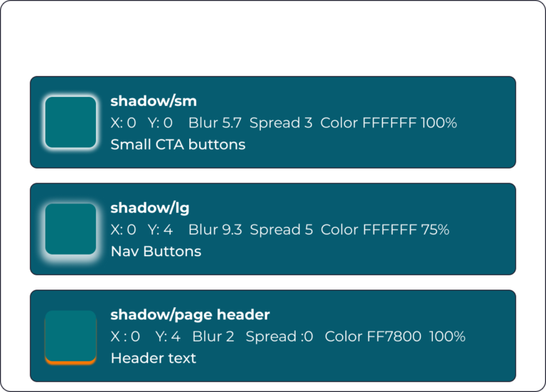
  • Visual Hierarchy & Content Prioritization: Designed primarily for mobile viewports, the interface uses a responsive typographic scale ranging from 32px bold headers down to 14px captions. This distinct hierarchy creates clear visual anchors, allowing users to effortlessly scan different options.
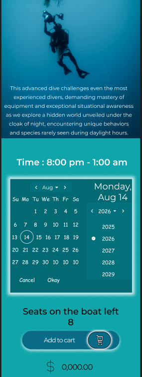
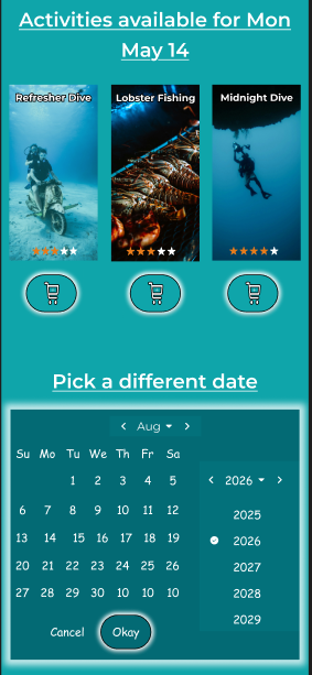
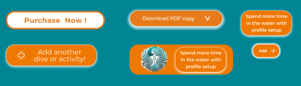
  • Custom card containers neatly encapsulate complex dive schedules and pricing info, creating clear visual boundaries that organize content into digestible steps. primary CTAs (like the bright orange Purchase Now! and Add another dive or activity! buttons) stand out against the deep teal palette to instantly direct user focus toward high-converting checkout actions.


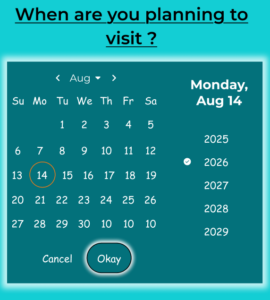
    • Component Consistency & Reusability: Standardized UI patterns (like date selectors, and dropdown filters) ensure a familiar experience across screens.

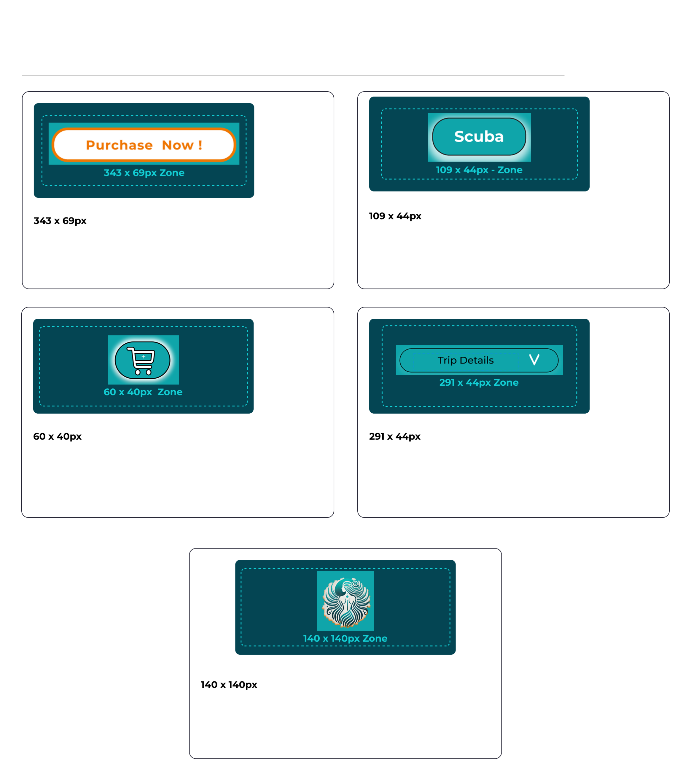
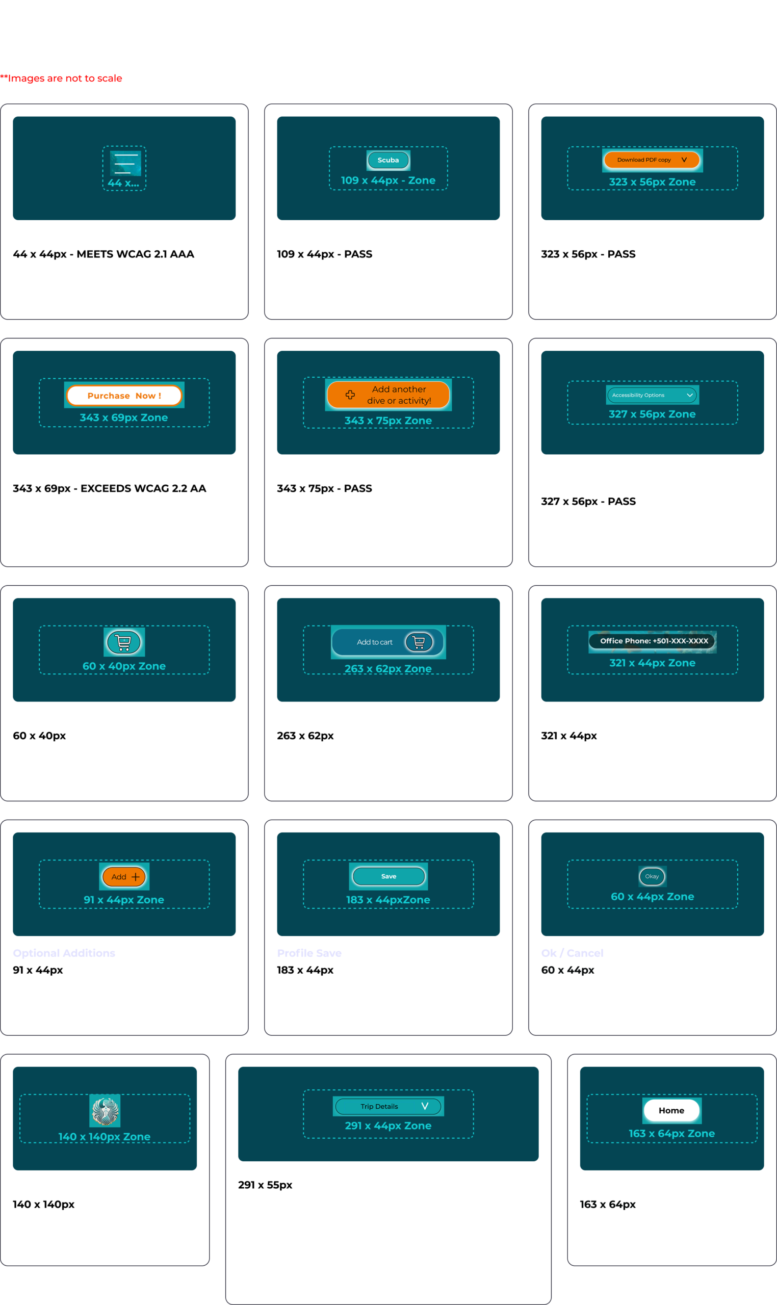
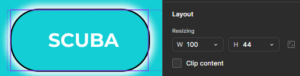
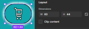
  • Mobile-First Responsive Design: Built specifically for mobile interaction, the layout uses fluid spacing and flexible card grids to adapt across small viewports. All primary interactive elements including booking buttons and calendar selectors are engineered with a minimum tap target of 44×44px to prevent mis-clicks and ensure easy thumb navigation
  •  
  • Prioritizing Clarity Over Decoration: Pairing an ocean-inspired color palette with intentional section spacing and clean card layouts, the design sets an immersive atmospheric mood while eliminating unnecessary visual noise.

  1. Type Scale & Hierarchy Spec Sheet:
  2. Font Family Montserrat

Token / RoleSizeWeightLine HeightLetter SpacingUse Case
Display Heading / H132pxBold40px (1.25\times)1pxHero and page main title
Heading / H224pxSemiBold32px (1.33\times)0pxTopic headings
Button / Medium18pxBold24px (1.33\times)0pxActivity navigation button labels
Input / Text18pxMedium24px (1.33\times)0pxBooking drop-down labels
Button Large18pxBold24px (1.33\times)0pxContact company button labels
Card Title / H416pxBold20px (1.25\times)0pxActivity card titles
Body Emphasized16pxSemiBold24px (1.5\times)0pxUnique CTA / promo banner text
Body Text16pxRegular24px (1.5\times)0pxStandard body paragraph text
Small CTA16pxMedium20px (1.25\times)0px“See More” CTA button labels
  • Multiple ways to navigate: My client wanted to show off the new services available, however this conflicts with a streamlined approach to the traditional funnel flow. I solved this by creating a Dual Entry Conversion funnel.
  • Funnel strategy: Designed to accommodate two distinct user mindsets Intent Driven and Exploration Driven before funneling both streams into a unified, low friction checkout flow.

Top of Funnel

Intent-Driven Path (Pick by Date): Targets planner type users with fixed travel itineraries. They select specific dates on the home screen calendar to instantly filter available excursions, minimizing search time and driving quick conversion.
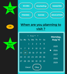
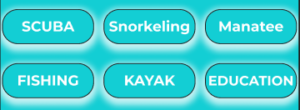
Exploration-Driven Path (Pick by Activity): Targets discoverers looking to explore all offerings (e.g., Scuba, Fishing, Kayak). Browsing category cards lets them view activity details, difficulty levels, and photos before choosing a date.
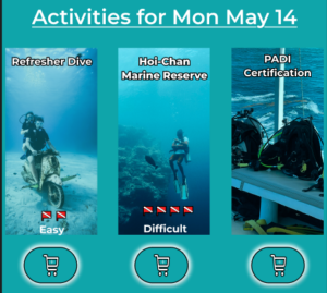
Middle of Funnel

Customization & Consideration: Regardless of the entry path, both user groups converge onto detailed activity page featuring transparent scheduling, real-time seat availability and details about the activity. Those that choose to setup a profile on the site can also create custom gear packages to suit their needs for added convenience.
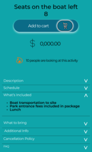
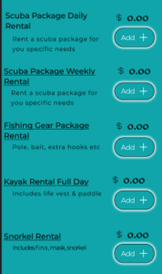
 

Bottom of Funnel

Profile & Payment Setup: Captures essential diver details (certification, party size) and saves payment information early to reduce friction.
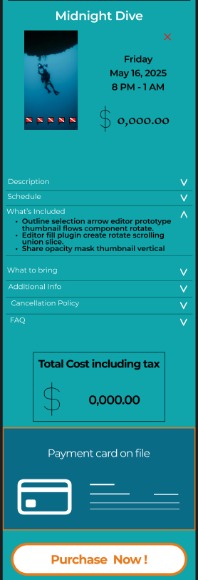
 

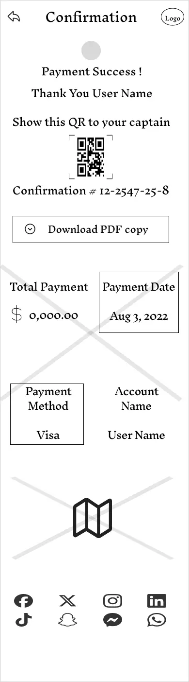
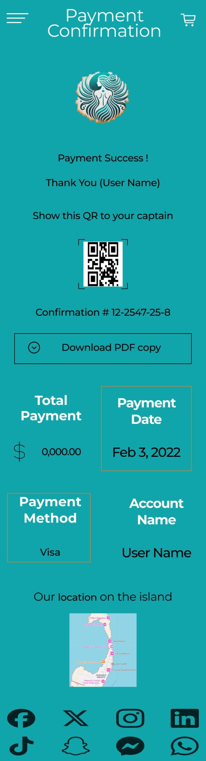
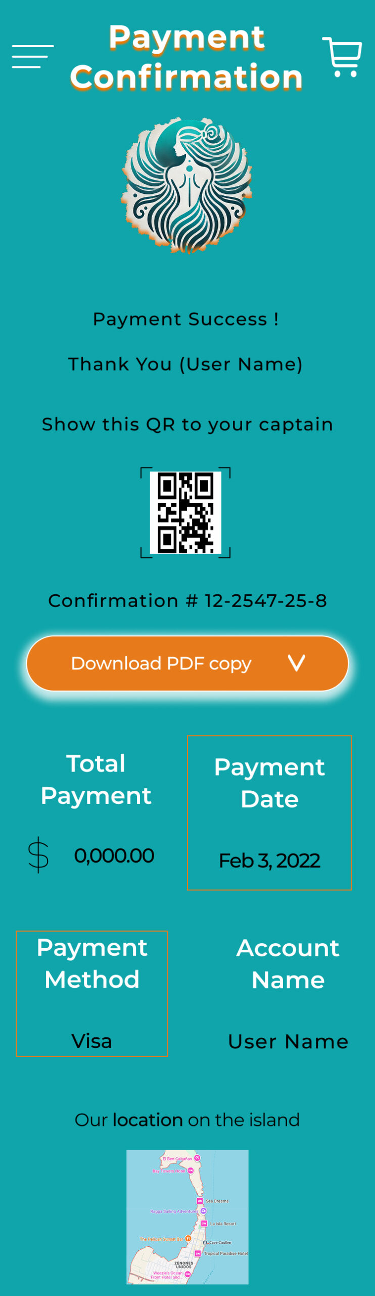
Multi-Item Cart & Purchase: Allows adding multiple activities before a clear 1-click purchase confirmation screen complete with QR pass verification.
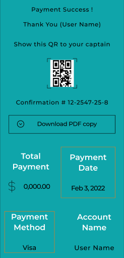
My component library establishes a unified visual language by pairing a clear button hierarchy from high-emphasis conversion CTAs to subtle filter pills with functional, domain specific iconography. Together, these standardized interactive controls and visual indicators streamline user navigation, highlight key excursion details, and drive friction-free bookings.

  1. Primary Action Buttons:  High-emphasis orange pills reserved for key conversion steps
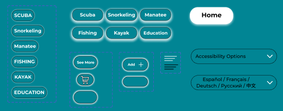
  2. Category & Navigation Filters: Low emphasis outline pills for filtering activities and secondary page routing.
  3.  
  4. Contact Components: Medium emphasis dark pills for external communication channels.
  5.  
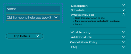
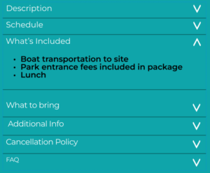
  6. Accordions / Disclosure Controls: Full width expandable pill headers for contextual information.
  7.  
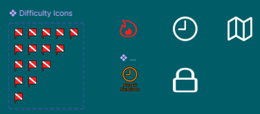
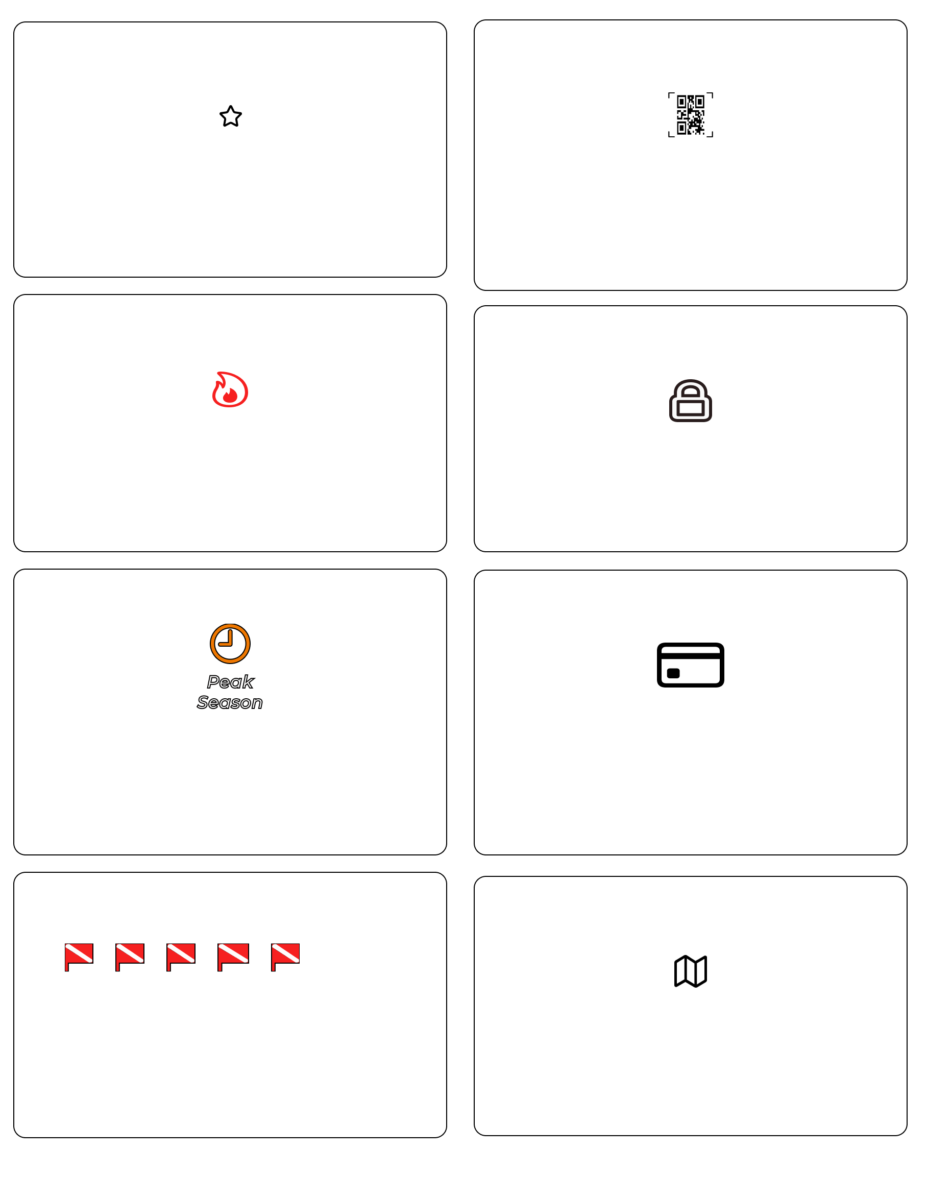
  8. Domain-Specific Visual Indicators: Specialized icons such as the dive flags for difficulty rating, the flame for popular demand, and the clock for peak season activities provide contextual visual cues tailored to the excursion booking flow.
  1. Transaction & Security Icons: Standardized UI iconography (credit card, lock, map pin, QR pass) establishes user trust during checkout.
  1. Brand Asset Scaling: The primary brand mark is componentized into multiple responsive sizes to maintain visual balance across mobile cards, headers, and footer layouts.
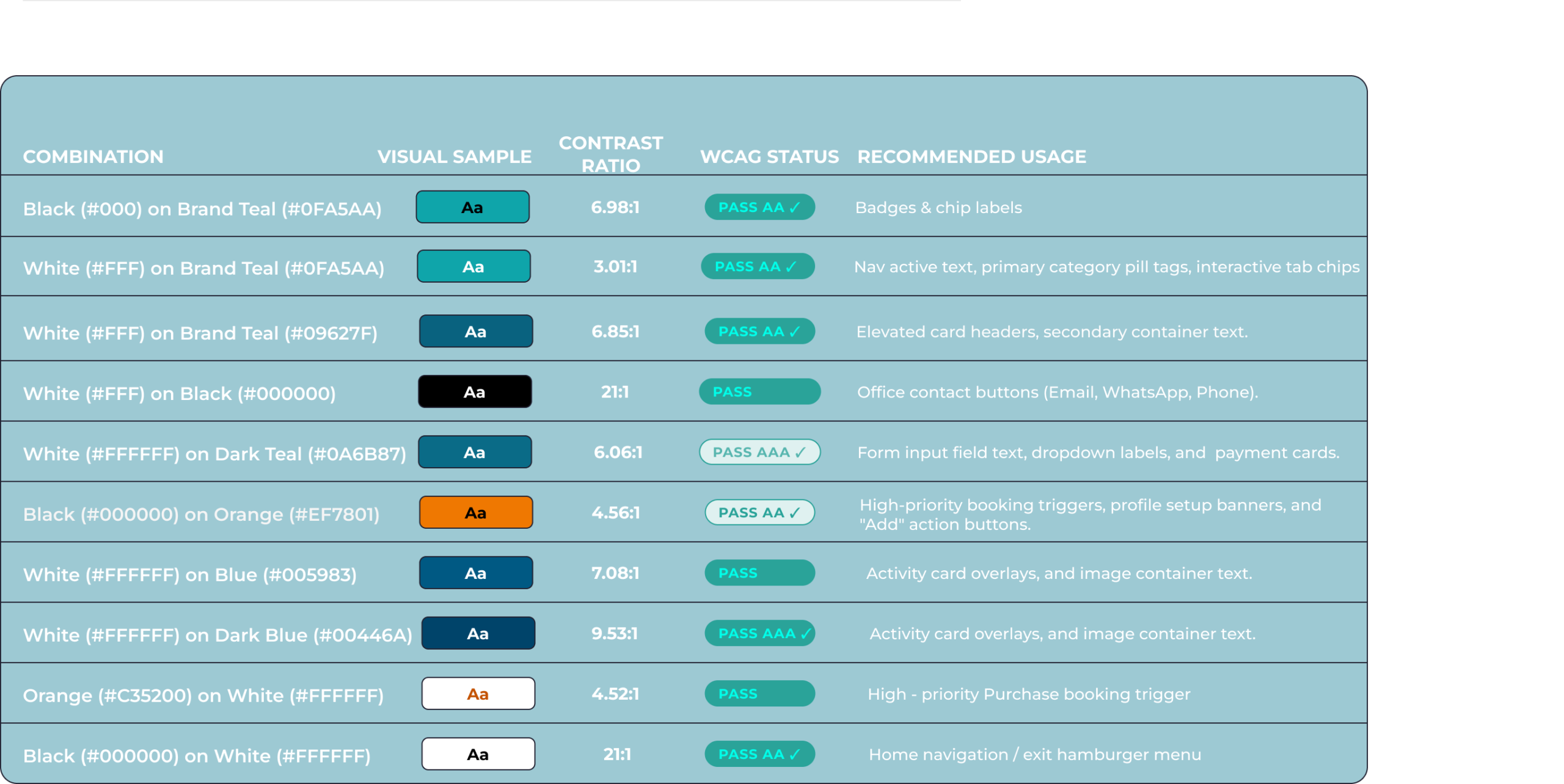
    • High-Contrast and Accessible Touch Targets: Prominent orange CTAs and dark pill containers with white text create high contrast visual hierarchy against background imagery. Generous button height and padding meet mobile touch target guidelines (minimum 44×44 px) to prevent mis clicks and improve accessibility for users with motor impairments. 

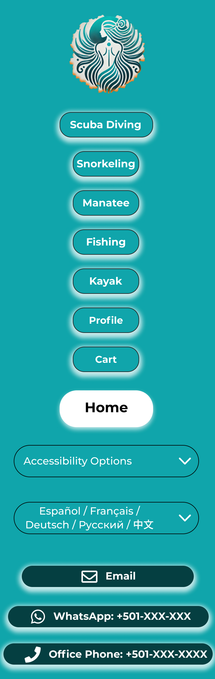
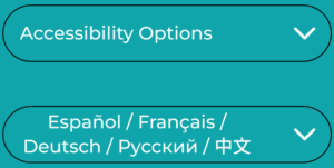
    • Multi-Language & Accessibility Preferences Menu: Dedicated controls in the side menu allow users to easily switch languages (Español, Français, Deutsch, etc.) and toggle accessibility settings, supporting inclusive navigation for non-native speakers and users with specific display needs.
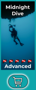
    • Dual Visual Coding for Complex Information:  I paired clear iconography with distinct visual badges such as difficulty flags, and status indicators making complex booking details readable at a glance for users with cognitive or visual impairments.
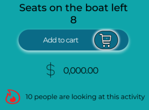
    • Scannable Information Hierarchy: Using clear vertical spacing, bold sub-headers, and structured card layouts allows users relying on screen readers or experiencing cognitive fatigue to process long booking details without friction.
    •  
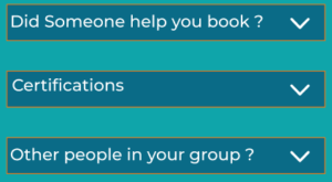
    • Structured Form Inputs: On the profile and checkout screens, form fields include explicit labels and inline hints rather than relying solely on disappearing placeholder text.
    •  
    • Transparent Communication Channels: Offering multiple direct contact methods (Email, WhatsApp, Phone) in standardized pill layouts ensures users can easily seek support or alternative accommodations.

    •  
    • This mobile-first layout centers around ergonomic interaction, making complex screens comfortable for natural thumb reach. Generous proportions and intentional spacing keep content highly readable without visual clutter Strict Base-

    •  
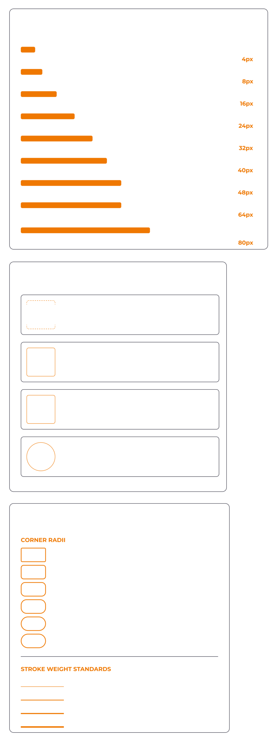
    • 8 Spatial Rhythm: By standardizing all Auto Layout padding and gaps to increments of 8px, components across every mobile view maintain strict mathematical harmony and visual balance.

    • Consistent Vertical Flow & Density: Card stacks, form controls, and interactive list items demonstrate unified vertical rhythm, giving complex screens like the calendar picker and activity listings a clean, structured appearance.

    • Predictable Component Separation: Generous 8px based spatial boundaries ensure distinct visual separation between distinct content groups, making dense UI layouts effortless to scan and read on mobile viewports
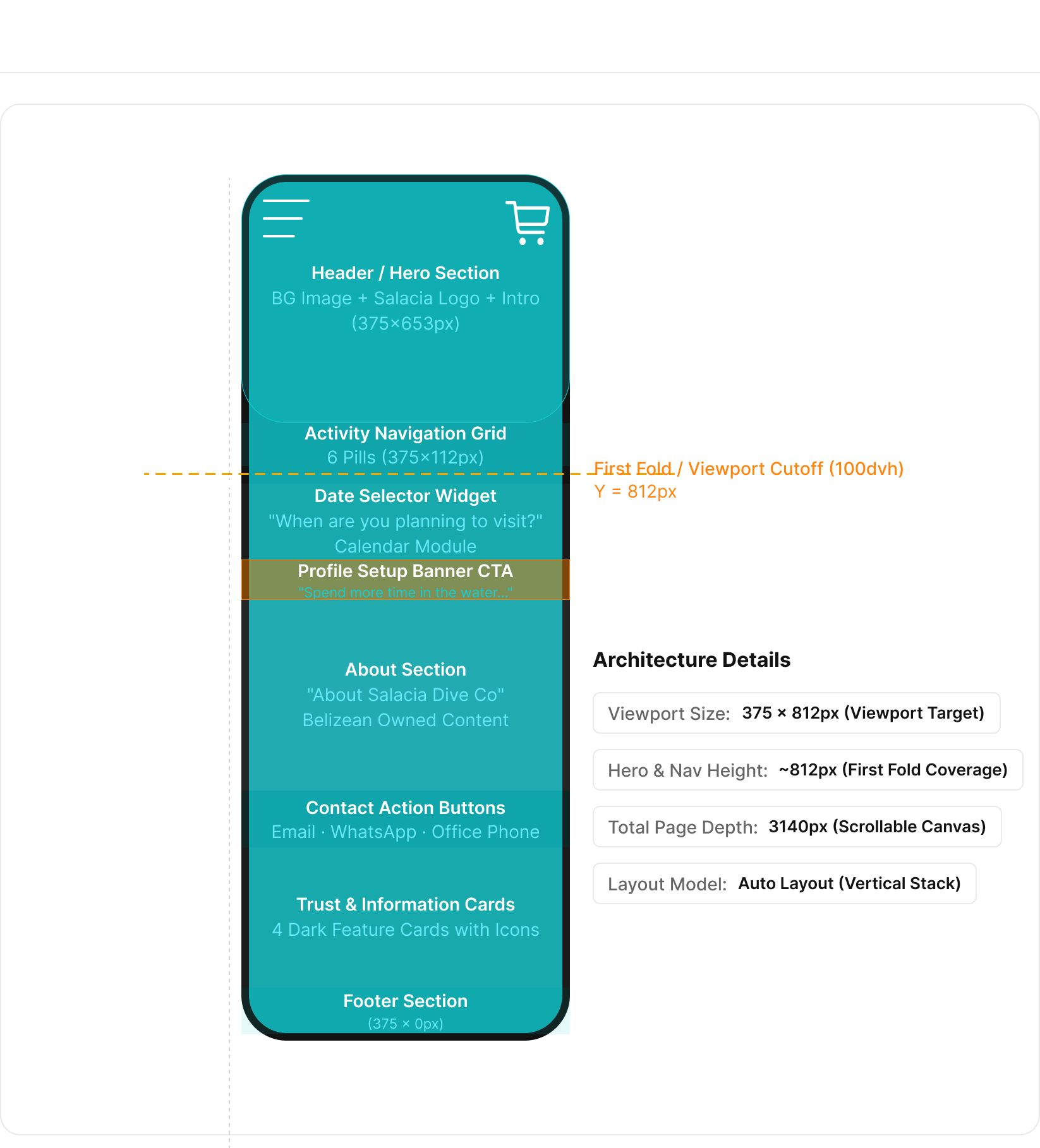
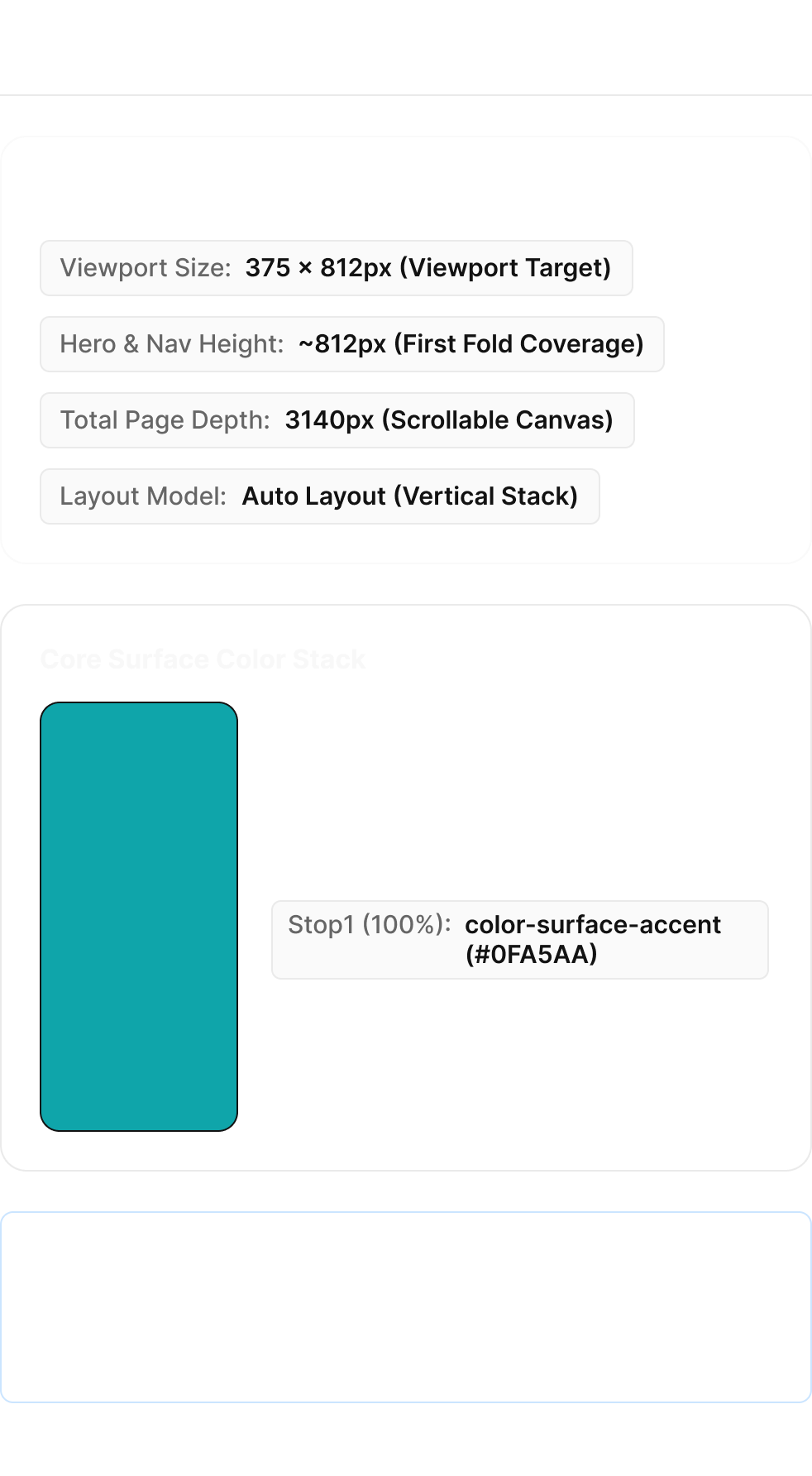
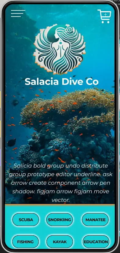
Designed specifically for a mobile viewport, establishing accurate first-fold coverage and scrollable canvas depth

Next iteration...

Overall, the second round of usability testing confirmed the app is intuitive and supports users in completing key tasks. The feedback we received highlighted a few important opportunities for refinement—mainly around visual clarity, spacing, and reinforcing the purpose of the profile feature. These insights will guide the next iteration, focusing on polish, accessibility, and clearer communication of value.

Future iterations...

There are additional features that weren’t covered in these first two rounds of user surveys. Future iterations, will explore these features further to ensure they align well with user needs.

Client reception

I presented a high-fidelity Figma prototype that brought the app’s concept to life, allowing the client to experience the product’s flow and feel firsthand. The client was thrilled with the results, noting that the design not only met their business requirements but also incorporated their feedback seamlessly. This prototype served as a powerful tool for visualization, leaving the client confident in the project’s creative direction.